 Rick and Porty Shirt Design Close Up TeePublic Print Quality Reivew
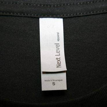 Rick and Porty Shirt Design TAG TeePublic Print Quality Reivew
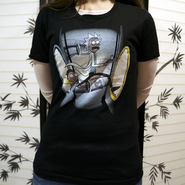 Rick and Porty Shirt Design Worn TeePublic Print Quality Reivew
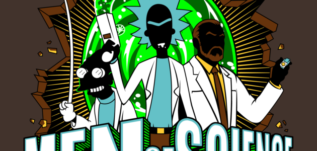
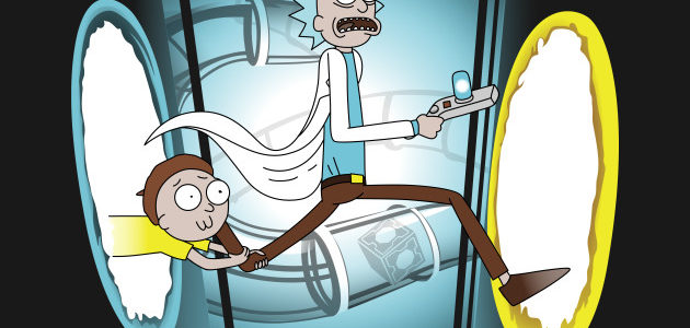
The Rick and Porty shirt design is for the Rick and Morty and Portal fans. They done gone crossover in this one broh.
Let's consider the concept, it is obvious but funny. At first, nothing seems unusual for the pair as they run to other dimensions via portals. But upon closer inspection, the rifts are not the usual Green ones that they are known for producing. Instead, these are the ones from the hit video game Portal, a completely different franchise all together. Thus making this a necessary mash up. Personally, I feel that it should had used the Portal gun from the game rather than Rick's usual portal gun but that is just my humble opinion. However, there is enough here for anyone familiar and observant enough to get the references.
As for the artwork, it is not original by any means nor is it that difficult to illustrate. But the scene does come together well for the concept. For instance, the colors are true to the Rick and Morty series, just as they work well for the Blue and Yellow port holes from Portal. Also, there is a good gradient for fade off for the background, preventing this from being a boring "square" design". So it is aesthetically pleasing. What isn't shown are lasers or whatever is chasing them, which is a disappointment as it could add much to the action of the scene. Or at least provide and explanation. Regardless to the fact that nothing out of the ordinary is really happening I have to go ahead and give the artwork 5 stars just for being awesome. Wubba Lubba dub dub!
As for the print, it is good but the company usually prints better and bolder for the Blue end of the spectrum. There is not enough of an issue to take away any stars though. If you happen to have an issue with your print you could always return it if it is truly defective. This one was printed up in the middle of the 2016 Christmas rush and features a tag rather than being their normal tagless offering.
This Rick and Porty Shirt will make a nice gift for inter-dimensional travel buffs and fans of these franchises. Especially the Rick and Morty fans.