Let Me Out Tee Design by Prime Premne

Let Me Out Tee Design Review.

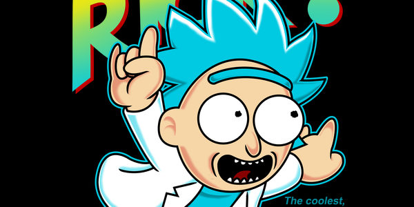
The Let Me Out tee design is for Rick and Morty and Mario fans. TINY RICK!

The concept is a hilarious mash up and parody of Nintendo's Classic Super Mario Bros. 3 video game and Cartoon Network's Rick and Morty Episode -Big Trouble In Little Sanchez (shown below). This is one of a few different versions of this concept by the same artist with varying text and layouts. Who wouldn't want to play a video game starring TINY RICK!?

As for the artwork, the coloring is crisp and vibrant, it works well on any color shirt. The shading is soft and is suitable for both franchises. This particular layout and version of this design is the one that more closely resembles the actual Super Mario Bros 3 game cover art. The texts "The coolest, most popular !@#$%&* KID in school yet!", "Wubby (Let me Out) Lubby Doob Doob", (Let Me Out) this is not a shirt" add plenty of show references to make any die hard fan happy.

While this is the Super Mario Bros. pose it is definitely more of a Rick and Morty fan tee.
Let Me Out Tee Design by Prime Premne.

Is available on T-shirts, Hoodies, Long Sleeves, Sweatshirts and Dog T-shirts. Many fabric color choices are available. The review breakdown is as follows:

Night Watch Bros. Tee Design by BazNet.

Game of Bros. Tee Design Review.

THIS DESIGN IS NO LONGER AVAILABLE FROM THIS RETAILER.

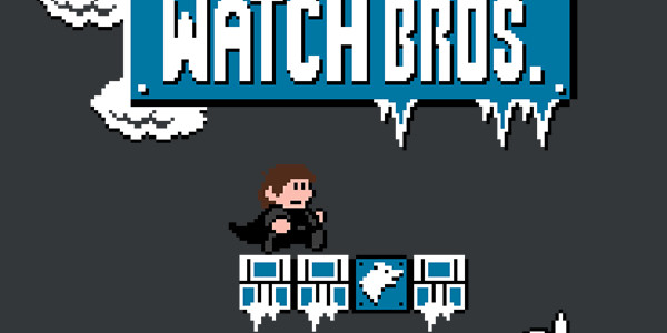
The Game of Bros. tee design is for Game of Thrones and Super Mario Bros. fans that can't can't get enough of either.

Keeping your land safe from the white skinned walking dead can be seen as a grueling battle with yourself and the elements, or it can be seen as a game best played with iron and fang. You can always rely on your bros to help you through even the most difficult winter conditions, and when others arrive to take your extra lives it’s time to punch blocks and prepare for the winter coming to your console. Whether you decide to vie for the throne or simply achieve a high score you’re going to need the proper gear to survive the winter, like this Game of Bros. t-shirt by BazNet!

This a cool mashup and one of the better ones for both Super Mario Bros. and Game of Thrones. An 8-Bit Night's Watch if you will as it has enough references to make any fan happy. A Crow, Jon Snow, Ghost, Samwell Tarly, a White Walker and a Stark sigil.

As for the artwork, the coloring consisting of Black, White, Blue, Brown and Peach like Skin tones and winter aspects for the Game of Thrones element and no shading to match the Super Mario Bros. design style.

This Game of Bros. tee would make a great gift for the fans of both franchises. It is like buying them 2 gifts in 1. It will satisfy the GOT fans that grew up playing the old school NES.

Game of Bros. Tee Design by BazNet.

Is available on T-shirts, Hoodies, Long Sleeves, Sweatshirts and Dog T-shirts. Black or Charcoal colored fabric are the only choices. Black fabric will mean losing some details to the background so Charcoal is recommended. The review breakdown is as follows:

I Need More Pots Tee Design by trheewood.

I Need More Pots Tee Design Review.

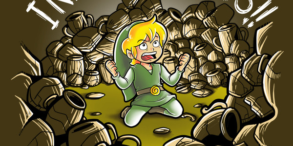
The I Need More Pots tee design shows Link at his most vulnerable moment. He is a hoarder, surrounded by pots. He wants more, you could call him a pot head. Can you blame him? Smashing pots is fun.

The concept is funny but obvious. Link has many odd quirks that make him the lovable hero of time. But one of the quirks is something that most of Hyrule must hate with a passion. His selfish obsession for smashing pots. Sure he gets loot but what of his morality? Breaking and entering, vandalism, larceny... he's almost as bad of an influence as that druggie Mario. The theme of clay pots has been used for Link/Zelda tees almost as much as the color Green. This one has a lot going for it as for design and gag variation. However, there should be more spacing between the words. Especially since the text is written in all caps.

As for the artwork, it is balanced, clean and well drawn. The colors are bright, the shading is good with central lighting. The character expression is the same as the Castaway "WILSON" or the Planet of the Apes "Statue of Liberty" moments. It fits the theme theme perfectly.

This is a relatable tee that fans of the Legend of Zelda franchise would like.

I Need More Pots Tee Design by trheewood.

Is available on T-shirts. Military Green colored fabric is mandatory. More color options would had been nice. The review breakdown is as follows:

Hyrulean Science Tee Design by Obvian.

Hyrulean Science Tee Design Review.

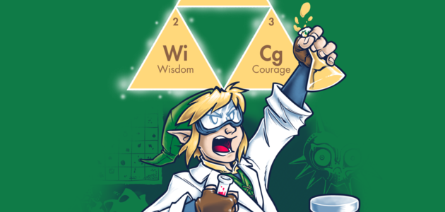
The Hyrulean Science tee design is for the science nerds and the Legend of Zelda fans. Be it Chemistry or Alchemy there is wizardry going on here.

The concept is smart and funny at the same time. Since there are only 3 forces or elements that matter in the Hyrulean world, the Triforce is like a simplified periodic table even if it doesn't have traditional atoms or even a mention of RGB pixels as the building blocks for all virtual matter in Link's universe. But never mind that, check out the Master Sword "scalpel" or Master Scalpel. Obvian's own design description is worth reading too.

In the words of the brave Hyrulean scientist who plotted out the periodic table of (three) elements: "Haaa! YAAAAA! Haaa. Huuraaagh!"

As for the artwork, its coloring and shading are as professional as it gets. There is awesome balance and weight to the design, as you can see the dark background stuff is at the bottom and the Triforce and Yellow potion are bright and held high. The "background stuff" are Game elements that are included in the background as design elements. Damn this tee has all kinds of meanings for "elements" included for our entertainment.

This Hyrulean Science tee will make a nice gift for any Legend of Zelda fans.

This is a good gaming tee that is bound to get some laughs.

Hyrulean Science Tee Design by Obvian.

Is available on T-shirts, Hoodies, Tank tops and Crewnecks. Many fabric colors are available. The review breakdown is as follows:

Blowing Bits Tee Design by Naolito..

Blowing Bits Tee Design Review.

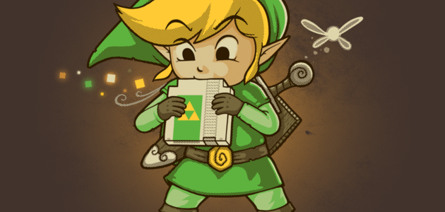
The Blowing Bits tee design is for everyone that owned an original NES (Nintendo Entertainment System) that played The Legend of Zelda games and who blew into the cartridges to clean the connectors in order to make the games work.

The concept is good and fitting being based on a Nintendo franchise character. Having Link play a cartridge like his famed Ocarina is sadly funny and cute at the same time. "Sad" because it was very much advised to not blow into the cartridges. Yet everyone did and or does it. IT WORKS. That's all that needs to be said on that matter.

As for the artwork, the colors and shading are nice which is to be expected from Naolito's designs. The layout is balanced well consisting of colored square design elements representing musical notes, magic and or debris and Navi on the opposite side. The implied (air) flow is consistent as his hat, hair and breath flow in the same direction. Which are details that most people would neglect. The focal point is of course the NES cartridge which bares the Triforce on its sticker. Personally, I would prefer that the cartridge be GOLD in color like the Legend of Zelda games being a Zelda inspired tee but to each their own.

This Blowing Bits tee will make a nice gift for 80's Nintendo and Legend of Zelda fans.

This is a lighthearted t-shirt that fits in anywhere, especially Comic-Cons.

Blowing Bits Tee Design by Naolito.

Is available on T-shirts, Hoodies, Tank tops and Crewnecks. Many fabric colors are available. The review breakdown is as follows:

Ultimate Link Tee Design by Fernando Sala.

Ultimate Link Tee Design Review.

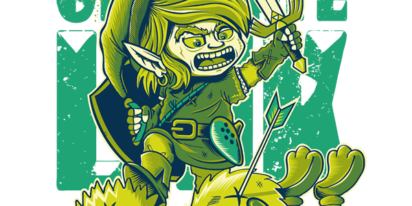
The Ultimate Link tee design is a crossover design that plays on the rivalry between Link and the hive minded cuccos (chickens) of Hyrule. Even though in the games Link gets what he deserves for instigating the violence.

The concept is funny but dark and twisted. Link hates cuccos so damn much that he takes out his anger and frustration against all birds. Hence the appearance of two of the most famous fictional avian characters Angry Birds and Big Bird in the cross over. With the Master Sword and Hylian shield, Link has slain them in cold blood.

As for the artwork, it is good and sports a green monotone color scheme like an old school game boy game. The shading is a little inconsistent as Link has relatively none at least on his skin and clothing. That and he doesn't cast a shadow over the corpses. Sure there are some hatched and filled in areas like inside the hat, the back of the shield and in his ear for example but his left side of his face should have some shading. Perhaps to emphasize Link and his living essence more than the other characters. Other than that it is drawn rather well and is a different take on the character so no points are removed for the shading in this case.

This is a demented but funny Zelda themed tee that fans of the Legend of Zelda franchise would like, at least the angry ones. By that statement, I am not condoning that anger is good and people should attack animals and Muppets as that behavior is wrong.

This is good gaming shirt that is meant to make Link's fans laugh.

Ultimate Link Tee Design by Fernando Sala.

Is available on T-shirts, Hoodies, Sweatshirts, Long Sleeve Tees and Tank Tops. Many fabric colors are available. The review breakdown is as follows:

Intensive Care Unit Tee Design by Alberto Arni

Intensive Care Unit Tee Design Review.

The Intensive Care Unit tee design is for the Mario fans that want a little reality added to their game references.

Lava Burn Ward Tee Design by ROCKHART

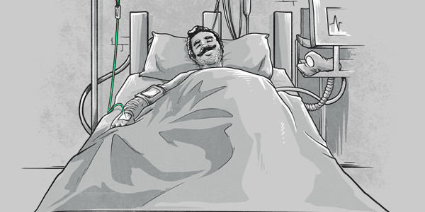
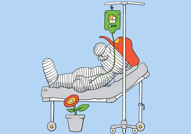
The concept is that Mario is always injured and must need some kind of healthcare and medicine. He always gets his cherished 1 Up Mushroom to give him back his life or to get extra lives. It is not 100% original as you can see the Lave Burn Ward tee also exist by another artist called ROCKHART (shown above). This Alberto Arni version however, takes a more realistic approach. Look at the perspective and details to see what I mean. The foot of the bed is foreshortened. Mario (implied by the 1 Up Mushroom and the mustache) has 5 O'clock shadow.

As for the artwork, It has a "Pleasentville"/"Sin City" type of effect where one tiny bit of the entire image is in color while the rest is in Black and white. It emphasizes the main point of the gag. The shading isn't 100% perfect as some things have shadows on the right, other things have it on the left. If the shading were consistent it would get a 5 stars but it's not so overall the design gets a 3.5 stars.

Adult Mario fans would enjoy having this tee in their collection. It is a bit too morbid for kids.

It is a good casual tee to wear anywhere or at any event that features Nintendo or gaming in general.

Intensive Care Unit Tee Design by Alberto Arni.

Is available on T-shirts. White and Silver colored fabric are the only choices.

Tanuki Revenge Tee Design by Vintz.

Tanuki Revenge Tee Design Review.

The Tanuki Revenge tee design is for anti-Mario people and the sadistic Mario fans.

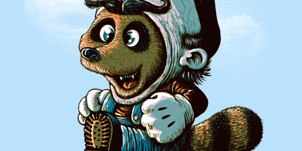
The concept is simple and self explanatory. The poor raccoon animal known in Japan as the Tanooki or Tanuki who's skin that Mario and Luigi like to wear in order to give them flying abilities turns the tables. This on makes a gruesome suit out of Mario's skin and has an even more twisted expression of joy on its face. Wait a minute. That's the same smile Mario wears on his face when the roles are reversed. Mario gets what he deserves here because he is one sick son of a bitch.

As for the artwork, it is great. Disturbingly so with sick details like veins and whatnot. The colors and shading are as professional as it gets and the style is the same demented stuff that inspires nightmares and Tim Burton movies.

This is a nice change and break from the normal Nintendo themed tees that flood the market.

This funny shirt is good for any lighthearted occasion and place. Especially where video games are involved. PETA would love it.

Tanuki Revenge Tee Design by Vintz.

Is available on T-shirts. Ice Blue and Silver colored fabric are the only choices. They work well for this design as they double as the color of the sky.

Forever Young Tee Design by Nasken

Forever Young Tee Design Review.

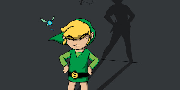
The Forever Young tee design is a mash up that comes to everyone's mind at some point or other Link and Navi with Peter Pan and Tinkerbell.

The concept is okay. Link and Navi are solid with their shadows taking the shape of Peter Pan and Tinkerbell. I'm not sure if anything else is being implied or not. Surely no one thinks there is any copyright infringement of any kind by Nintendo. Both sets of characters have many similarities. Link and Peter Pan are both heroes and are roughly the same ages most of the time (kids). They both wear green clothing and have their weapons of choice. Navi and Tinkerbell are both fairies that follow their boy in green around everywhere.

As for the artwork, it isn't bad. It has appropriate colors and moderate shading. The stance is a bit off for the shadow to be properly aligned so it is forced for the sake of the concept.

This is a good "green tights club" Zelda themed tee that kids of all ages should love.

This casual shirt is good for getting double takes.

Forever Young Tee Design by Nasken.

Is available on T-shirts.

Many fabric colors are available. The review breakdown is as follows:

Dawn of Gaming Tee Design by Naolito

Dawn of Gaming Tee Review.

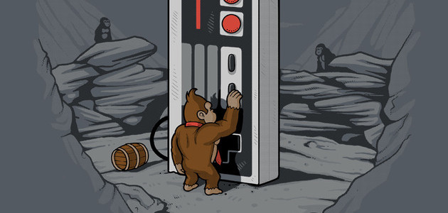
The Dawn of Gaming tee design is for the Donkey Kong fans that dig science fiction movies such as 2001: a Space Odyssey.

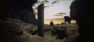
The concept replaces the man apes and monolith of 2001: A Space Odyssey with Donkey Kong and an original NES controller. Which is a great idea but the fact that Donkey Kong is wearing his trademark tie and that there are barrels around implies that he is already familiar with some sort of technology. This defeats the point of the monolith aspect as it is supposed to be the first technology of any kind that is witnessed by the man apes. Then again, how else are people supposed to know that it is Donkey Kong right? It is still cool regardless and most people won't analyze the Hell out of the design like I do, so go for it.

2001: A Space Odyssey

As for the artwork, it is professional through and through. Good coloring and shading. The background as awesome as it is with the man apes and all is grayed out providing more focus to Donkey Kong and the controller which are in color.

This Dawn of Gaming tee will make a nice gift for the Nintendo enthusiasts as well as the Stanley Kubrick and Arthur C. Clarke fans.

This is a good gamer and Sci-Fi shirt that fits in anywhere such as Comic-Con or to rock concerts.

Dawn of Gaming Tee Design by Naolito.

Is available on T-shirts, Hoodies, Tank tops and Crewnecks. Asphalt fabric color is mandatory. The review breakdown is as follows: