 Firstly, solid color backgrounds look like crap when put on any color of tee (Shown above). The design would just look like a rectangle or piece of paper on a tee. This is as unprofessional as it gets. It not only makes your tee look bad but it reflects on the printing company that you are using especially if it is a POD (Print On Demand Service).
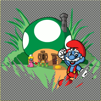
Secondly, if you use a transparent background (Shown Below) you can place the design over almost any color fabric (depending on the design, if your design needs to be Blue to replace a sky then you don't want to put the design on a Red tee).
Firstly, solid color backgrounds look like crap when put on any color of tee (Shown above). The design would just look like a rectangle or piece of paper on a tee. This is as unprofessional as it gets. It not only makes your tee look bad but it reflects on the printing company that you are using especially if it is a POD (Print On Demand Service).
Secondly, if you use a transparent background (Shown Below) you can place the design over almost any color fabric (depending on the design, if your design needs to be Blue to replace a sky then you don't want to put the design on a Red tee).
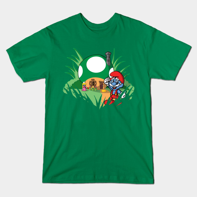
 Thirdly, if you really know your craft you can do all kinds of cool stuff with transparent backgrounds. You can have areas of your design empty so that the shirt color fills in those areas.
This is cool for the Subject Matter, the Background, and the Foreground. Shape the transparency into the design (Shown Below).
Thirdly, if you really know your craft you can do all kinds of cool stuff with transparent backgrounds. You can have areas of your design empty so that the shirt color fills in those areas.
This is cool for the Subject Matter, the Background, and the Foreground. Shape the transparency into the design (Shown Below).