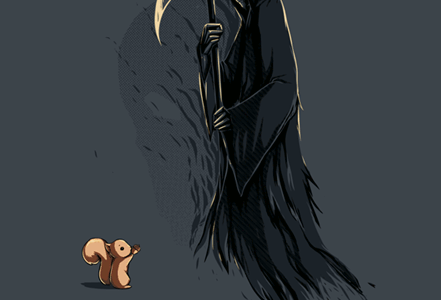
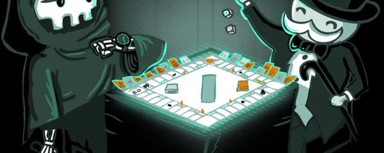
This Shirt is Temporarily Unavailable Sorry, we're not printing this one at the moment. Check back tomorrow when the catalog re-opens.
Solved It Tee Design Review.
This Shirt is Temporarily Unavailable Sorry, we're not printing this one at the moment. Check back tomorrow when the catalog re-opens.
Solved It Tee Design by BootsBoots.
Asphalt is the only fabric color available. Black could had worked too but then the shading could not be seen. The review breakdown is as follows:Waiting For My Fish Tee Design Review.
The Waiting For My Fish tee design is a cat lovers perfect shirt. Done in a surreal art style with an iridescent-like coloring for the fur.
Waiting For My Fish is a cute and playful tee that stands out from countless feline themed shirts. The bold bright colors give this artwork a modern vibe. The space elements of the stars and moon along with the globe-like eyes that lure the viewer in, make this tee seem otherworldly and trippy.
As weird as this tee is, the attention to details and coloring go far beyond what is usually called for a shirt. Where the whiskers overlay the fur to the texture of the ground, NARNIAZ did an outstanding job on those points.
The design does look a little square as the borders do not fade off into the shirt fabric with any subtlety, but it does not have straight edges which is a plus.
This design makes for a great casual shirt to be worn anywhere. Especially, at a cat show.
Waiting For My Fish Tee Design by NARNIAZ.
Is available on: Tees, Phone Cases and Wall Art. Black fabric is mandatory and it works well with this artwork as it can mimic the night sky and provides great contrast. It also provides the color for the shading. The review breakdown is as follows:
Science Consider Yourself Warned Tee Review.
This Shirt is Temporarily Unavailable Sorry, we're not printing this one at the moment. Check back tomorrow when the catalog re-opens.
Science Consider Yourself Warned Tee Design by patrickspens.
Slate is the only fabric color available and it doubles as some of the midtones. The review breakdown is as follows:WANDERING BEAR Tee Design Review.
The WANDERING BEAR tee design reminds me of the Lite Brite only more elegant and sophisticated. A silhouette of a black bear is surrounded by contrasting colors composed of hundreds of tiny dots. The "Lite Brite" effect is largely due to the pseudo bio-luminescent glow of the flowers that make up the fields reflecting the moonlight. These ranging colors going from lighter bottom to a darker top also help to create the atmospheric perspective giving the illusion of distance in the form of a horizon. Other details include a full moon and a meteor in sky glittered with stars.
Wandering Bear is a beautiful balance of light and dark, colors and negative space. Florent Bodart's artistry shines through in this piece.
The WANDERING BEAR design makes for a great casual shirt to be worn anywhere.
WANDERING BEAR Tee Design by Florent Bodart.
Is available on: Tees, Phone Cases and Wall Art. Black fabric is mandatory and it works best with this artwork as it represents the night. The review breakdown is as follows:
Grim Optimism Tee Design Review.
This Shirt is Temporarily Unavailable Sorry, we're not printing this one at the moment. Check back tomorrow when the catalog re-opens.
Grim Optimism Tee Design by ramyb.
Asphalt is the only fabric color available and it doubles as some of the midtones. The review breakdown is as follows:Little Girl Playing Tee Design Review.
At first glance, the Little Girl Playing tee design makes people think of Game of Thrones, specifically, the character Daenerys Targaryen which is probably unintentional. The bold silhouette style art backed by fluffy white clouds provide awesome contrast and simplicity. This makes it easy to see and make out the objects from a distance. The whimsical notion of a tiny and frail girl holding onto a leash and controlling a massively fierce dragon is as much empowering as it is delightful. This is modern take on an ages old subject about a creature that used to abduct young maidens. Once your head is wrapped around that concept, the artwork takes on a entire new level of appreciation.
Little Girl Playing is an awesome fantasy design and it is both fun and playful. Los Tomatos executed the idea well.
This design makes for a great casual shirt to be worn anywhere. Especially, if fantasy gaming or movies are involved.
Little Girl Playing Tee Design by Los Tomatos.
Is available on: Tees, Sweatshirts and Phone Cases. Light Blue fabric is mandatory and it works best with this artwork as it mimics the sky. The review breakdown is as follows:
Cucco Sriracha Tee Design Review.
The Cucco Sriracha tee design is a Legend of Zelda fan and foodie dream tee.
It depicts a cucco from the Legend of Zelda universe as the logo for a mashup with the famous Sriracha sauce which would typically show a rooster instead.If you are like most food geeks then you are probably familiar with the Sriracha Sauce brand and more than likely you put in on everything. Either to improve something's flavor, to give it a kick, or to hide the taste of the actual food.
If you are a Hyrulian, then you know that you do not mess with the Cucco, cause they will eff you up quicker than anything else in the game. Those birds aren't chicken, they are fierce and full of fowl play.
The art is clean, simple and spot on. The phrases on the label add to the Hyrulian fun. Such as "Do not Hit", "Don't Shake", "Anju the Cucco Lady Inc." and "Kakkariko Village, Hyrule".
Blair Campbell, executed this design flawlessly and must be a fan of both franchises.
At first glance, people might actually miss that this is a Legend of Zelda reference as it mashed up so perfectly it passes as the legit Sriracha sauce.
Cucco Sriracha Tee Design.
Is available on: Tees. Red fabric color is mandatory and it is the only color that will work with this design. The review breakdown is as follows:
Donut Panic Tee Design Review.
This Shirt is Temporarily Unavailable Sorry, we're not printing this one at the moment. Check back tomorrow when the catalog re-opens
Donut Panic Tee Design By Capttylor34.
Printed on Cranberry color fabric only which doubles as blood shading and the coloring of the inside of the mouth. The review breakdown is as follows:Ghostrescuers Tee Design Review.
The Ghostrescuers tee design is a funny spoof of the Ghostbusters franchise and logo.
Well this Ghostbusters parody had to be made at some point. Each of the original four Ghostbusters are included in this scene. They are either facing away or have their faces covered with gear. The tie in of the Proton Pack being represented as a toolbox is a hilarious touch. But all of those details cannot compare to the priceless expression of shame and embarrassment on the face of the busted ghost that is being rescued. Note how Spengler is wearing his goggles and how Ray is staying is the one comforting the trapped spirit, staying true to their characters.
The artwork is clean and it is colored and shaded masterfully. The faded skyline in the horizon is an unnecessary detail but it looks awesome regardless. The mirror image of the prohibited symbol or "No" sign has some vintage distressing for even more aesthetics.
This parody is perfect to wear at any casual setting and all fans of the Ghostbusters movies will love to have this tee.
Ghostrescuers Tee Design by ronin84
Is available on: Tees, Phone Cases and as Wall Art. Stone color fabric is mandatory and it works best with this artwork as it is a neutral color that makes up the coloring of the Ghostrescuers uniforms. The review breakdown is as follows: