Duffmind Tee Design by Melonseta.

Duffmind Tee Design Review.

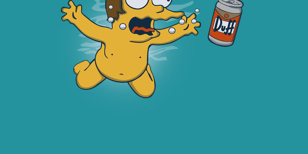
The Duffmind tee design is for Simpsons fans that enjoy Nirvana and beer.

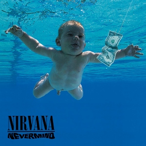
This design is based off of Nirvana's Nevermind album cover art (shown below). It depicts a baby Barney instead of a naked human baby and a can of DUFF beer instead of a dollar bill. It is a funny mash up that represents the 90's decade.

Nirvana Nevermind Album Cover.

So the artwork is a cartoon parody of the Nevermind album cover. The colors and shading are true to The Simpsons style. The water is simplified with adequate water wave effects, which prevents it from looking too cluttered and busy. Leaving the actual water color whatever the fabric color choice is. There is no fishing line so that is disappointing to some degree but not enough for me to detract any stars.

This is a good shirt for Generation X, fans of grunge and of The Simpsons. Even if a person is just 1 out of the 3 they would still dig this design.

Duffmind Tee Design by Melonseta.

Is available on T-shirts, Hoodies, Long Sleeves, Sweatshirts and Dog T-shirts. Deep Royal, Turquoise, Navy are the fabric colors available. The review breakdown is as follows:

Count Your Fingers Tee Design by glenbrogan.

Count Your Fingers Tee Design Review.

The Count Your Fingers tee design is for the people that grew up watching Sesame Street and possibly the people with Obsessive Compulsive Disorder.

The concept for the Count Your Fingers tee is combining the lore that vampires do not have reflections with the Count from Sesame street as he brushes his teeth. Thus, revealing the hand of the puppeteer that controls him. As a result the toothbrush seemingly floats in the air in the reflection.

As for the artwork, it is colored appropriately matching the muppet's true colors. The shading and whatnot is light and as consistent as it can be without making the design too busy and destroying the other details. The way the shirt becomes the glass and walls show's how T-shirt designs are supposed to be done.

This Count Your Fingers tee will make a nice gift for any fan of Sesame Street or people that are traditionalists.

This is a good casual shirt that fits in anywhere.

Count Your Fingers Tee Design by glenbrogan.

Is available on T-shirts, Hoodies, Tank tops and Crewnecks. A few light fabric colors are available depending on the style. The review breakdown is as follows:

Queen of Moons Tee Design by traceygurney.

Queen of Moons Tee Design Review.

The Queen of Moons tee design is for the nerdy and fans of Supernatural. Nerds need a champion and queen and here the underdog Charlie Bradbury happens to be both.

The concept of the Queen of Moons tee is art nouveau style tribute to the Supernatural character Charlie Bradbury (played by Felicia Day) and the LARP and the Real Girl episode. It has many references to her character and pop culture in general. From "I love you I know" (Star Wars), The Vulcan Salute (Star Trek), The White Tree of Gondor (Lord of the Rings), a icosahedron from Dungeons and Dragons and a circuit board pattern. These are the references that I know, there are a couple others in there as well. All really great choices that define her character very well.

As for the design, it is impressive. Some nice 3D shading paired with flat design elements creates an interesting effect which makes art nouveau difficult to do but Tracey nailed it. The Red color which was chosen on account of her hair works great with the theme. The layout is better than most art nouveau pieces. The fact that Charlies crown extends past its would be frame shows strong a artistic mindset with a great lack of respect for restrictions. Depth and interest that is what it is all about.

This Queen of the Moons tee will make a nice gift for any fan of Supernatural and empowered women.

This is a good casual shirt that fits in anywhere such as Comic-Cons. It would also make a good tee to wear while streaming Netflix.

Queen of Moons Tee Design by traceygurney.

Is available on T-shirts, Hoodies, Tank tops and Crewnecks. A few dark fabric colors are available depending on the style but BLACK is the best choice. As as the Black fabric makes up most of the design itself. The review breakdown is as follows:

Breaking Bed Tee Design by Boggs Nicolas.

Breaking Bed Tee Design Review.

The Breaking Bed tee design is for Breaking Bad fans and those people who do not take life too seriously.

This parody concept is a pun obviously. There is something comical about watching a grown man like Heisenberg jump up and down on a bed like a kid. In this case it is because it makes the criminal mastermind seem idiotic.

As for the artwork, it is a well colored cartoon with minimum shading. The character likeness could be better. Other fabric colors would had been nice as to allow the design elements such as the bed to stand out more. Also the font could use some work, the actual Breaking Bad font would had been better.

This Breaking Bed tee would make a a funny addition to any fan's collection. I wouldn't say it is a must have though.

I wouldn't recommend it as a school garment with the Breaking Bad reference.

Breaking Bed Tee Design by Boggs Nicolas.

Is available on T-shirts, Hoodies, Long Sleeves, Sweatshirts, Posters and Dog T-shirts. Dark Chocolate colored fabric is mandatory. The review breakdown is as follows:

Super Meeseeks Bros. Tee Design Review.

The Super Meeseeks Bros. tee design is for Rick and Morty and Super Mario Bros. fans that can't decide which to spot on their shirt.

The concept is a mash up of Super Mario Bros. 3 and Cartoon Network's Rick and Morty character Mr. Meeseeks. This is not the first nor last mashup of these 2 franchises as the Tiny Rick tee variations for example have proven to be popular.

As for the artwork, the coloring is accurate for the Rick and Morty cartoon but the style is a decent marriage of both franchises as it has some strong Mario elements as well. There isn't much in regards to shading but as for most designs it isn't needed anyway. The golf clubs carrying caddy version Mr. Meeseeks is the best Meeseeks reference so it works out perfectly.

Wear this anywhere casual attire is the norm.

Super MeeSeeks Bros. Tee Design by LavaLamp.

Is available on T-shirts, Hoodies, Long Sleeves, Sweatshirts, Posters and Dog T-shirts. Black, Charcoal, Silver and White are the fabric color choices are available. The review breakdown is as follows:

iFoodie Tee Design by Papyroo.

iFoodie Tee Design Review.

The iFoodie tee design is for the iZOMBIE fans, foodies and people who like cliches.

The concept is based the comic book and television show iZOMBIE,a cute almost kawaii art style and the old phrase "I am what I eat". Which is not only to say she is very smart since she is eating a brain, but she takes on the traits of the people's whose brains she ingests. The only thing missing from this is hot sauce.

As for the artwork, it looks like some Japanese cartoons, those with big eyes and tiny heads. The colors are good and the shading is non-existent except for some tonal differences in the font. It is definitely different than any other iZombie themed designs as most stay true to the comic or opening credit style. But there is something to be said about trying the cute angle on something Zombie related. And since it is a show with a strong female lead, it is only natural to make a design appeals to the female crowd as well. Not that women don't like horror with all the gore but sometimes it is nice to mash things up.

This is a great pop culture shirt that fits in anywhere such as Comic-Con or coffee shops.

iFoodie Tee Design by Papyroo.

Is available on T-shirts, Hoodies, Tank tops and Crewnecks. There are many fabric color options available. The review breakdown is as follows:

North Park Tee Design by Theduc.

North Park Tee Design Review.

THIS DESIGN IS NO LONGER AVAILABLE FROM THIS RETAILER.

The North Park tee design is for the Game of Thrones and South Park fans. Even though South Park did a mean parody of Game of Thrones in the Black Friday episode making fun of it (like they do everything else). This mash up parody is just as funny and awesome.

The concept is simply re-imagining the four main South Park kids and their school bus stop with a Night's Watch theme. Of course fatass Cartman is Samwell Tarly, Kyle as a White Walker (the angry eyes is definitely Kyle), Kenny as a corpse and Stan as Jon Snow. The South Park sign has been replaced with a North Park sign for more of a Game of Thrones vibe.

As for the artwork, the style is emulating South Park's style flawlessly. The colors and lack of shading couldn't be a better a match. The layout is taken from any bus stop scene featuring the South Park boys. The way the Game of Thrones character likenesses were applied does both franchises justice. The true to shows' facial expressions make this design what it is, had any of that been changed the design would had sucked. The crappy looking South Park style raven even fits in nicely fora smooth transition.

This North Park tee will make a nice gift for the Game of Throne fans (especially of Jon Snow).

Wear this tee to Comic-Cons and fantasy conventions. This is a fifty fifty mash up so fans of both franchises will be happy to add this to their collections. This probably isn't appropriate as school clothes for children though since both South Park and Game of Thrones are meant for mature audiences.

North Park Tee Design by Theduc.

Is available on T-shirts, Hoodies, Tank tops, Posters, Dog T-shirts and Crewnecks. As for the fabric color options there are many choices but no Black for this particular design. The review breakdown is as follows:

Brain Invaders Tee Design by Naolito.

Brain Invaders Tee Design Review.

The Brain Invaders tee design is for Futurama fans and those that have fond memories of arcade games.

The Brain Invaders concept is a mash up that includes the 80's child Philip J. Fry. He is playing the Space Invaders arcade game (with the Planet Express Ship "Bessie" shown on the bottom) as a space invader is attached to his head like a Brain Slug. The Brain Slugs being a reoccurring character/creature thoughout the Futurama series. On a deeper level it pokes fun of how people are mind controlled in a hypnotic trance like state when playing video games or even while watching television.

As for the artwork, the style is not that of Futurama but rather it is reimagined in some other cartoon style that uses Black eyes. The coloring is nothing short of awesome and is Futurama appropriate. The shading is decent as well with light from the screen shining on Fry's face.

This Brain Invaders tee sums up Fry's generation well. This design is funny and suitable as a Futurama tee as any Earthican would agree.

Brain Invaders Tee Design by Naolito.

Is available on T-shirts, Tank Tops, Hoodies, Long Sleeves, Sweatshirts, Posters and Dog T-shirts. There are many fabric color choices available. The review breakdown is as follows:

I Want To Be Alive Tee Design by Raffiti.

I Want To Be Alive Tee Design Review.

The I Want To Be Alive tee design is for South Park fans that enjoy watching the X-Files.

This concept based on the character Kenny McCormick and his tendency to get killed in the episodes and the "I Want To Believe" poster that could be seen in "Spooky" Fox Mulder's F.B.I. office. It is also the title of the second feature film installment of the X-Files franchise. As morbid as the concept is, it is based on humor and from the character's point of view, it is a true statement. That makes it a good T-shirt design.

I Want To Believe Poster X-files Mulder's Office

So the artwork is pretty much a straight rip of the actual cartoon character of Kenny, at least I can't see any changes. Therefore, critiquing the art is pointless. The evil and glowing Red eyes on the black vulture thing is a nice touch. Like the other parodies, the "I Want To Believe" concept makes the design funny and worthy as a shirt. Not the actual artwork itself. Because Kenny dying or not wanting to is nothing new and no longer entertains us. This design makes the concept funny again even if only for a brief moment. There are many parodies and mash ups of the I Want To Believe poster and they are usually not worth a damn. But this one is strikes a chord with the cleverness and play on words. It has nice colors and no shading.

This I Want To Be Alive tee would make a great gift for fans who like the X-Files and South Park equally well.

This is a great shirt to wear to a Comic-Con or wherever geekdom can be found.

I Want To Be Alive Tee Design by Raffiti.

Is available on T-shirts, Hoodies, Long Sleeves, Sweatshirts and Dog T-shirts. Many fabric color choices are available. The review breakdown is as follows:

Starry DeLorean Tee Design by Punksthetic.

Starry DeLorean Tee Design Review.

The Starry DeLorean tee design is for the Back To The Future fans that enjoy the art of Vincent van Gogh.

The concept is to combine the coolest time machine which comes from the Back To The Future trilogy with the Starry Night sky which is the perfect backdrop for anything dealing with space and time (Space time). This is one of the better Starry Night parodies and mash ups and if you've been paying attention to this blog you may have seen some reviewed already.

Starry Night by Vincent van Gogh

As for the artwork, the style is emulating Vincent van Gogh's obviously with the broad stroke swirls. Not an exact copy but enough to know its basis (No moon for example). The subject of this tee the DeLorean, is ore subtle than inserted than say the parody featuring Serenity. Black fabric is the better choice in this case as it helps all the colors to pop with much greater contrast. I do think this tee would had been even better had Hill Valley and the Clock tower been the town and prominent building depicted.

This Starry DeLorean tee will make a nice gift for the Back To the Future fans.

Wear this tee to Comic-Cons, Sci-Fi conventions and to art museums. Basically ANYTIME ANYWHERE.

Starry DeLorean Tee Design by Punksthetic.

Is available on T-shirts, Hoodies, Tank tops and Crewnecks. Black or Navy Blue are the only fabric color options but they are the only two colors that would work. The review breakdown is as follows: