Intensive Care Unit Tee Design by Alberto Arni

Intensive Care Unit Tee Design Review.

The Intensive Care Unit tee design is for the Mario fans that want a little reality added to their game references.

Lava Burn Ward Tee Design by ROCKHART

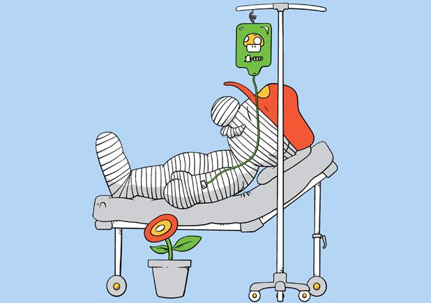
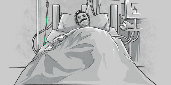
The concept is that Mario is always injured and must need some kind of healthcare and medicine. He always gets his cherished 1 Up Mushroom to give him back his life or to get extra lives. It is not 100% original as you can see the Lave Burn Ward tee also exist by another artist called ROCKHART (shown above). This Alberto Arni version however, takes a more realistic approach. Look at the perspective and details to see what I mean. The foot of the bed is foreshortened. Mario (implied by the 1 Up Mushroom and the mustache) has 5 O'clock shadow.

As for the artwork, It has a "Pleasentville"/"Sin City" type of effect where one tiny bit of the entire image is in color while the rest is in Black and white. It emphasizes the main point of the gag. The shading isn't 100% perfect as some things have shadows on the right, other things have it on the left. If the shading were consistent it would get a 5 stars but it's not so overall the design gets a 3.5 stars.

Adult Mario fans would enjoy having this tee in their collection. It is a bit too morbid for kids.

It is a good casual tee to wear anywhere or at any event that features Nintendo or gaming in general.

Intensive Care Unit Tee Design by Alberto Arni.

Is available on T-shirts. White and Silver colored fabric are the only choices.

Tanuki Revenge Tee Design by Vintz.

Tanuki Revenge Tee Design Review.

The Tanuki Revenge tee design is for anti-Mario people and the sadistic Mario fans.

The concept is simple and self explanatory. The poor raccoon animal known in Japan as the Tanooki or Tanuki who's skin that Mario and Luigi like to wear in order to give them flying abilities turns the tables. This on makes a gruesome suit out of Mario's skin and has an even more twisted expression of joy on its face. Wait a minute. That's the same smile Mario wears on his face when the roles are reversed. Mario gets what he deserves here because he is one sick son of a bitch.

As for the artwork, it is great. Disturbingly so with sick details like veins and whatnot. The colors and shading are as professional as it gets and the style is the same demented stuff that inspires nightmares and Tim Burton movies.

This is a nice change and break from the normal Nintendo themed tees that flood the market.

This funny shirt is good for any lighthearted occasion and place. Especially where video games are involved. PETA would love it.

Tanuki Revenge Tee Design by Vintz.

Is available on T-shirts. Ice Blue and Silver colored fabric are the only choices. They work well for this design as they double as the color of the sky.

Forever Young Tee Design by Nasken

Forever Young Tee Design Review.

The Forever Young tee design is a mash up that comes to everyone's mind at some point or other Link and Navi with Peter Pan and Tinkerbell.

The concept is okay. Link and Navi are solid with their shadows taking the shape of Peter Pan and Tinkerbell. I'm not sure if anything else is being implied or not. Surely no one thinks there is any copyright infringement of any kind by Nintendo. Both sets of characters have many similarities. Link and Peter Pan are both heroes and are roughly the same ages most of the time (kids). They both wear green clothing and have their weapons of choice. Navi and Tinkerbell are both fairies that follow their boy in green around everywhere.

As for the artwork, it isn't bad. It has appropriate colors and moderate shading. The stance is a bit off for the shadow to be properly aligned so it is forced for the sake of the concept.

This is a good "green tights club" Zelda themed tee that kids of all ages should love.

This casual shirt is good for getting double takes.

Forever Young Tee Design by Nasken.

Is available on T-shirts.

Many fabric colors are available. The review breakdown is as follows:

A Very Long Time Ago Tee Design by Vintz.

A Very Long Time Ago Tee Design Review.

The A Very Long Time Ago tee design is for Star Wars and Gremlins fans.

This concept is effing hilarious and clever. If you have ever wondered what the love child of Yoda and an Ewok would look like, this is it. Whether you wanted to think about that or not. But that is not the funniest or even most disturbing part. Check out how creepy Yoda looks with his bulging eyes and old man pipe. It's like viewing one of those post-mortem photos. Add all of those elements together and behold, one of the greatest pop culture tees of all time. If this tee looks familiar, it is because the design used to be sold at Threadless... (Also) a long time ago.

As for the artwork, it is drawn in a cartoon style that is made up to look like an old early photograph from the Victorian Era. Think Conté Crayons on cardboard. The shading and highlights are superb. The facial expressions are on par with damn near all the old time portraits. Probably because people had to be still for a long time for the photographic plates to be exposed. At first, it took roughly 15 minutes. Then just a couple years later it was down to a couple of minutes. Which is still a long time to have to strike a pose. That and people back then were ashamed of their teeth due to the lack of dental care and hygiene. Either way, Vintz nailed it.

This tee is for any Star Wars and Gremlins fans or at least of the cute Mogwai form.

Wear this tee everywhere that tees are appropriate. It would make a great conversation starter at Comic-Cons and Sci-Fi conventions.

A Very Long Time Ago Tee Design by Vintz.

Is available on T-shirts, Hoodies, Long Sleeves, Sweatshirts and Dog T-shirts. Dark Chocolate fabric color is mandatory for tees, Black for Sweatshirts. Dark Chocolate is a good choice because it gives the design the nostalgic Sepia photo appearance. The review breakdown is as follows:

Sword Of The Master Tee Design by TeeKetch

Sword of the Master Tee Design Review.

The Sword of The Master tee design is for the people that like the stories of young heroes and adventure. Especially, if they happen to be a young King Arthur or Link. Which this tee is based on both.

The concept is good and the style is on par with The Sword In The Stone cartoon. Both have a Sword in the stone (or anvil) in their storylines.

As for the artwork, the colors is good and the shading is minimal. The textures of the anvil, gateway and ground are done with simple splotches. It looks like old VHS cover art. The art and text are done in the Sword In The Stone drawing style.

This Sword of the Master tee will make a nice gift for the fantasy and RPG lovers. The ones that are Legend of Zelda fanatics and those who love The Once and Future King or The Sword In The Stone will wear this Sword of the Master tee like it was their skin.

This is a good casual shirt that fits in anywhere such as Comic-Con or while gaming.

Sword of the Master Tee Design by TeeKetch.

Is available on T-shirts, Hoodies, Tank tops and Crewnecks. Navy Blue colored fabric is mandatory. The review breakdown is as follows:

Busted Ghost Tee Design by Naolito.

Busted Ghost Tee Design Review.

The Busted Ghost tee design is for the Pac-Man and Ghostbusters fans.

The concept is far from original as there have been various Ghostbusters and Pac-Man mash ups and parodies. This one uses the ghost trap as a coffin. Speedy aka "Pinky" is the ghost in the coffin but the character is shown as a dark blue. This is because when Pac-Man eats a power pellet the ghost turn blue then they can be chomped. However, once chomped they no longer have their "sheet" or color as they just roam around as floating eyes. This was done this way because eyes only would look weird in a coffin. The best part of this design though and by far the funniest thing about it is how Shadow aka "Blinky" stares at the coffin like he knows something is not quite right.

As for the artwork, it is a decent illustration but it isn't perfect. For starters, where is the other lid flap and hinges for the coffin? At first glance people might not notice that it is missing. Some may never notice. Second, the shading is great except the lighting on the ghost in the trap is different. It is just a cartoon type design so it really doesn't matter so much but I notice it. IT was done that way to show the contour of Pinky because that is the only visible side. Illustrators often break the rules of physics to force a perspective. It does however look good, it has great coloring. The layout is perfect. the middle ghost Pokey aka "Clyde" is raised a little in order to have him stand behind the others so they aren't in a perfect straight line. Making it look more natural and overall better than lined up like ducks in a row. Each ghost also has their own facial expression.

This Busted Ghost tee will make a good gift for Pac-Man or Ghostbusters fans. Basically anyone that was around in or at least born in the 80's will appreciate it.

There are no Kids' tees for this design from this retailer so it gets docked for that.

Wear this tee anywhere and everywhere that tshirts are socially acceptable.

Busted Ghost Tee Design by Naolito.

Is available on T-shirts. Black Fabric is Mandatory. The review breakdown is as follows:

Say No To Drugs Tee Design by Harebrained

Say No To Drugs Tee Design Review.

The Say No To Drugs tee design is for the Super Mario Bros. fans that have a warped sense of humor. As well as the ones that note the drug references in the beloved game series.

Of all the Tanooki Suit themed Super Mario Bros. based designs, this one is my favorite. Maybe it can be considered a parody but it's not that much of a stretch from the actual game. A drug crazed Mario is just going around killing everything and collecting serial killer type trophies (Bowser Skin as a suit). Skeletons and half eaten mushrooms trail behind him with a burning castle in the background. He's covered in blood, somewhat oblivious in his own reality thanks to his altered state of consciousness. He is enjoying himself! It's sick, funny and just plain wrong. I love it.

As for the artwork, it is clean and badass. Great layout and action. The coloring is great and shading isn't needed so there is only a little bit here and there. A Red stroke (outline) surrounds Mario and the troopa shell. Which would make the design stand out on almost any color tee except for a Red one. But that does not matter because this Harebrained chose to only offer Black tees.

This Say No To Drugs tee will make a great for any Mario fan. However, it is not appropriate for kids.

This is a good design to wear whenever you want to make fellow gamers laugh. Wear it anywhere such as to a bar, comic-con, or E3.

Say No To Drugs Tee Design Harebrained.

Is available on T-shirts, Hoodies, Long Sleeves, Sweatshirts and Dog T-shirts. Black colored fabric is mandatory but it is the best color for this design so no points will be taken away. The review breakdown is as follows:

Pipes N Castles Tee Design by In Stank We Trust.

Pipes N Castles Tee Design Review.

The Pipes N Castles tee design is for the Super Mario Bros. fans that listened to Guns N' Roses during their gaming session.

The concept is an alright mash up. If you can imagine Mario, Luigi, Princess Peach, Toad and Bowser as a heavy metal band. It's not the best nor the worst Guns N' Roses album cover parody or mashup by any means. And there are many out there. But it hits all of the requirements needed for the concept to work. All of the main characters from Super Mario Bros. video games have their skulls on a cross which replace the skulls of the Guns N' Roses band members. Instead of the title "Appetite for Destruction" in the bottom banner it has "Appetite for Jumping" which is somewhat humorous.

As for the artwork, it is simple and cartoonish. It is definitely closer to the Super Mario Bros. drawing style than it is to the edgier Guns N' Roses album art. It lacks some of shading aspects that GNR's artwork had but that just plays into the NES territory.

If this was a real album or even a video game soundtrack, Welcome to the Warpzone would probably be one of the songs.

This is a fun design that metal heads and Nintendo fans would appreciate.

Pipes N Castles Tee Design by In Stank We Trust.

Is available on T-shirts, Hoodies, Long Sleeves, Sweatshirts and Dog T-shirts. Many fabric color choices are available. The review breakdown is as follows:

Dawn of Gaming Tee Design by Naolito

Dawn of Gaming Tee Review.

The Dawn of Gaming tee design is for the Donkey Kong fans that dig science fiction movies such as 2001: a Space Odyssey.

The concept replaces the man apes and monolith of 2001: A Space Odyssey with Donkey Kong and an original NES controller. Which is a great idea but the fact that Donkey Kong is wearing his trademark tie and that there are barrels around implies that he is already familiar with some sort of technology. This defeats the point of the monolith aspect as it is supposed to be the first technology of any kind that is witnessed by the man apes. Then again, how else are people supposed to know that it is Donkey Kong right? It is still cool regardless and most people won't analyze the Hell out of the design like I do, so go for it.

2001: A Space Odyssey

As for the artwork, it is professional through and through. Good coloring and shading. The background as awesome as it is with the man apes and all is grayed out providing more focus to Donkey Kong and the controller which are in color.

This Dawn of Gaming tee will make a nice gift for the Nintendo enthusiasts as well as the Stanley Kubrick and Arthur C. Clarke fans.

This is a good gamer and Sci-Fi shirt that fits in anywhere such as Comic-Con or to rock concerts.

Dawn of Gaming Tee Design by Naolito.

Is available on T-shirts, Hoodies, Tank tops and Crewnecks. Asphalt fabric color is mandatory. The review breakdown is as follows:

Missing Link Tee Design by wirdou

Missing Link Tee Design Review.

The Missing Link tee design is for the Legend of Zelda fans that are into evolution be it biological or archaeological.

The concept isn't original but the execution is. Illustrating Link as fossilized remains for the "Missing Link" gag is a different approach compared to Link standing next to apes and early man in a progression up to homo sapiens.

As for the artwork, it is a fun but slightly morbid cartoon. The best part is that Navi has finally STFU! But aside from that, the coloring and shading look great. The simple effect of circles and smears to create the ground layer works well for a tee. Brown is a better choice of farbic as it resembles dirt or the earth the best.

This Missing Link tee will make a nice gift for any Legend of Zelda fans.

This is a good gamer shirt. Wear it to Comic-Cons or when going on a fast-food run.

Missing Link Tee Design by wirdou.

Is available on T-shirts, Hoodies, Tank tops and Crewnecks. Many fabric colors are available depending on the style but Brown works the best with this design, concept and design title. As as the Black fabric makes up most of the design itself. The review breakdown is as follows: