Kenny Bros Tee Design by Melonesta.

Kenny Bros Tee Design Review.

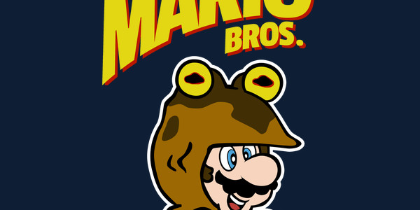
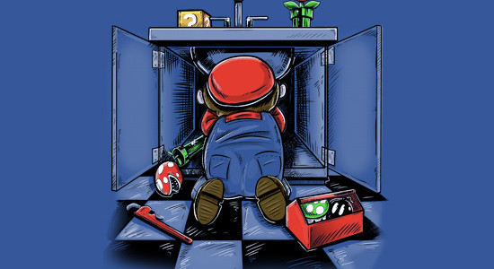
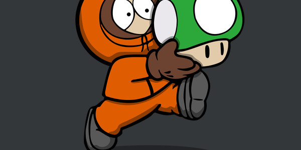
The Kenny Bros tee design is for South Park and Super Mario Bros. fans.

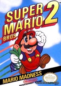
The concept for the Kenny Bros tee is that Kenny dies an infinite amount of times and he could use (or does use hmmm?) 1-Up mushrooms for extra lives. Having him drawn in the Mario style in a video game Super Mario Bros. 2 (Shown below) cover art parody is the best way to illustrate this idea. The best part by far is that the mushroom is bigger than his head.

Super Mario Bros. 2 Cover.

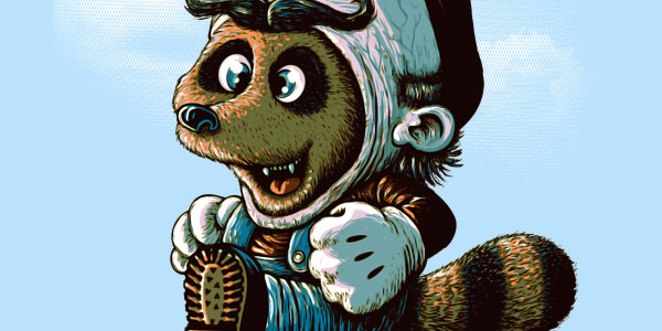
As for the artwork, it is a nice mix of South Park and Super Mario Bros. drawing styles. The coloring is good. The mild shading is a bit inconsistent as it isn't over all of the elements. But that is okay because no one will notice.

This is a welcomed mashup with lots of humor. Of all the Super Mario Bros. parodies out there this one is deserving. Perhaps some version with text would be even better.

This funny shirt is good for any lighthearted occasion and place. Especially where video games are involved.

Kenny Bros Tee Design by Melonesta.

Is available on T-shirts. Charcoal, Dark Chocolate, and Navy are the only fabric color choices. They work well for this design they offer the most contrast.

Castle Lovers Tee Design Naolito.

Castle Lovers Tee Design Review.

The Castle Lovers tee design is for the Super Mario Bros. fans that want more drama in the franchise.

The concept for the Castle Lovers tee design is that there is a love triangle involving Mario, Princess Peach and Luigi. That in itself is not original as it has been done numerous times before.At any rate, here Mario has no idea that Princess Peach is seeing his brother but he suspects that something is going on with someone. So Luigi is hiding to keep their secret by dangling outside the castle window. Princess Peach has a worried and guilty expression on her face. Overall, it is funny and a bit sad at the same time.

As for the artwork, the colors are Super Mario Bros. appropriate and are purposely muted to set a mood. The splotches in random places and in the dark areas has little to be desired however but it still makes a damn good shirt.

You can almost hear some cheesy soap opera theme music.

This Castle Lovers tee is for the adult gamers. Where it to Comic-Con, E3 etc.

Castle Lovers Tee Design Naolito.

Is available on T-shirts, Hoodies, Long Sleeves, Posters, Sweatshirts and Dog T-shirts. Black colored fabric is mandatory and really the best option. The review breakdown is as follows:

Krieger's Laboratory Tee Design by kgullholmen.

Krieger’s Laboratory Tee Design Review.

The Krieger's Laboratory tee design is for the Dexter's Laboratory and Archer fans. Who doesn't side with the mad scientists?

The concept is a good 50/50 mashup of Dexter (the cartoon scientist not the serial killer of serial killers) and Dr. Algernop Krieger. It blends the twisted world of Krieger's experiments into Dexter's lab. They have a lot of themes in common. For 2 cartoons from different decades, the humor proves timeless.

As for the artwork, it is done in the Dexter's Laboratory style. The flat background simple backgrounds paired with a colorful foreground character. And by color I mean blood splatter and toxic green substances. The angry bitter face works with both franchises. But more impressive than illustrating in the Dexter's Laboratory style is the subtle signature and how it is incorporated into the design. The way a signature should be.

Anyone that enjoys both cartoons will want to add this tee to their collection as it is one of those generation gap fillers that bring like-minded folks together (at least the mad scientists types)..

Krieger's Laboratory Tee Design by kgullholmen.

Is available on T-shirts. Charcoal, Deep Royal, Navy, Turquoise and White are the fabric color choices that are available. They work well for this design as they double as the color of the sky.

Hypno Mario Bros. Tee Design by DutyFreak

HypnoMario Bros. Tee Design Review.

The HypnoMario Bros. tee design is for the Futurama fans and Super Mario Bros. Fans.

The concept is simple, funny and self explanatory mash up. Rather than a plain ole boring frog suit that Mario and Luigi would wear to give let them swim faster, jump higher, swim through water currents and hop while on land, this suit presumably gives them the powers of the Hypnotoad.

As for the artwork, it appropriately represents both franchises well. The Hypnotoad eyes are done well enough. The colors work on any Fabric color thanks to the White stroke around the suit that makes it stand out on darker color fabrics. Everything else is taken from Super Mario Bros. 3 such as the font styling, the pose and Mario's face. There is no shading but it really isn't needed, even thoguh it would had been nice to see the extra detail.

This funny shirt is good for those who miss Futurama and have fond memories or moments playing any Super Mario Bros. game.

HypnoMario Bros. Tee Design by DutyFreak.

Is available on T-shirts. Many fabric color choices are available. They work well for this design as they double as the color of the sky.

Let Me Out Tee Design by Prime Premne

Let Me Out Tee Design Review.

The Let Me Out tee design is for Rick and Morty and Mario fans. TINY RICK!

The concept is a hilarious mash up and parody of Nintendo's Classic Super Mario Bros. 3 video game and Cartoon Network's Rick and Morty Episode -Big Trouble In Little Sanchez (shown below). This is one of a few different versions of this concept by the same artist with varying text and layouts. Who wouldn't want to play a video game starring TINY RICK!?

As for the artwork, the coloring is crisp and vibrant, it works well on any color shirt. The shading is soft and is suitable for both franchises. This particular layout and version of this design is the one that more closely resembles the actual Super Mario Bros 3 game cover art. The texts "The coolest, most popular !@#$%&* KID in school yet!", "Wubby (Let me Out) Lubby Doob Doob", (Let Me Out) this is not a shirt" add plenty of show references to make any die hard fan happy.

While this is the Super Mario Bros. pose it is definitely more of a Rick and Morty fan tee.

Let Me Out Tee Design by Prime Premne.

Is available on T-shirts, Hoodies, Long Sleeves, Sweatshirts and Dog T-shirts. Many fabric color choices are available. The review breakdown is as follows:

Your Favorite Plumber Tee Design.

Your Favorite Plumber Tee Design Review.

The Your Favorite Plumber tee design is for realists and Nintendo fans. Super Mario Bros. Fans particularly.

This concept is of course pointing out the fact that Mario is supposed to be a plumber by trade and not a superhero. Here he is doing a mundane job. While funny, it is still screwed up when considering that his first appearance was in Donkey Kong as a Carpenter. Anyway, you can see lots of Mario references other than just a view of his backside. 1-Up, Fire Flower, Bob-omb, a Potted Piranha Plant and a Question Box.

The Your Favorite Plumber design is also on children's apparel. Maybe in order to change their unrealistic expectations of what a plumber actually does for a living.

The artwork, it is a cartoon as to be expected, with good primary and secondary colors that are complementary rather than clashing. Adequate shading and highlights with some illusion of depth. It is executed rather well. But the best part of this tee is not what is included in the artwork, it is what is left out of it that makes us glad. What was left out you may be asking yourself..."Plumber's Crack" that's what. We can all be thankful for that.

Your Favorite Plumber Tee Design.

Is available on: Tees, Hoodies. Black fabric color is mandatory. Black is the best choice as the negative space is part of the design. But if the design was reworked to be on other colors it would appeal to more people. The review breakdown is as follows:

Intensive Care Unit Tee Design by Alberto Arni

Intensive Care Unit Tee Design Review.

The Intensive Care Unit tee design is for the Mario fans that want a little reality added to their game references.

Lava Burn Ward Tee Design by ROCKHART

The concept is that Mario is always injured and must need some kind of healthcare and medicine. He always gets his cherished 1 Up Mushroom to give him back his life or to get extra lives. It is not 100% original as you can see the Lave Burn Ward tee also exist by another artist called ROCKHART (shown above). This Alberto Arni version however, takes a more realistic approach. Look at the perspective and details to see what I mean. The foot of the bed is foreshortened. Mario (implied by the 1 Up Mushroom and the mustache) has 5 O'clock shadow.

As for the artwork, It has a "Pleasentville"/"Sin City" type of effect where one tiny bit of the entire image is in color while the rest is in Black and white. It emphasizes the main point of the gag. The shading isn't 100% perfect as some things have shadows on the right, other things have it on the left. If the shading were consistent it would get a 5 stars but it's not so overall the design gets a 3.5 stars.

Adult Mario fans would enjoy having this tee in their collection. It is a bit too morbid for kids.

It is a good casual tee to wear anywhere or at any event that features Nintendo or gaming in general.

Intensive Care Unit Tee Design by Alberto Arni.

Is available on T-shirts. White and Silver colored fabric are the only choices.

Tanuki Revenge Tee Design by Vintz.

Tanuki Revenge Tee Design Review.

The Tanuki Revenge tee design is for anti-Mario people and the sadistic Mario fans.

The concept is simple and self explanatory. The poor raccoon animal known in Japan as the Tanooki or Tanuki who's skin that Mario and Luigi like to wear in order to give them flying abilities turns the tables. This on makes a gruesome suit out of Mario's skin and has an even more twisted expression of joy on its face. Wait a minute. That's the same smile Mario wears on his face when the roles are reversed. Mario gets what he deserves here because he is one sick son of a bitch.

As for the artwork, it is great. Disturbingly so with sick details like veins and whatnot. The colors and shading are as professional as it gets and the style is the same demented stuff that inspires nightmares and Tim Burton movies.

This is a nice change and break from the normal Nintendo themed tees that flood the market.

This funny shirt is good for any lighthearted occasion and place. Especially where video games are involved. PETA would love it.

Tanuki Revenge Tee Design by Vintz.

Is available on T-shirts. Ice Blue and Silver colored fabric are the only choices. They work well for this design as they double as the color of the sky.

Say No To Drugs Tee Design by Harebrained

Say No To Drugs Tee Design Review.

The Say No To Drugs tee design is for the Super Mario Bros. fans that have a warped sense of humor. As well as the ones that note the drug references in the beloved game series.

Of all the Tanooki Suit themed Super Mario Bros. based designs, this one is my favorite. Maybe it can be considered a parody but it's not that much of a stretch from the actual game. A drug crazed Mario is just going around killing everything and collecting serial killer type trophies (Bowser Skin as a suit). Skeletons and half eaten mushrooms trail behind him with a burning castle in the background. He's covered in blood, somewhat oblivious in his own reality thanks to his altered state of consciousness. He is enjoying himself! It's sick, funny and just plain wrong. I love it.

As for the artwork, it is clean and badass. Great layout and action. The coloring is great and shading isn't needed so there is only a little bit here and there. A Red stroke (outline) surrounds Mario and the troopa shell. Which would make the design stand out on almost any color tee except for a Red one. But that does not matter because this Harebrained chose to only offer Black tees.

This Say No To Drugs tee will make a great for any Mario fan. However, it is not appropriate for kids.

This is a good design to wear whenever you want to make fellow gamers laugh. Wear it anywhere such as to a bar, comic-con, or E3.

Say No To Drugs Tee Design Harebrained.

Is available on T-shirts, Hoodies, Long Sleeves, Sweatshirts and Dog T-shirts. Black colored fabric is mandatory but it is the best color for this design so no points will be taken away. The review breakdown is as follows:

Pipes N Castles Tee Design by In Stank We Trust.

Pipes N Castles Tee Design Review.

The Pipes N Castles tee design is for the Super Mario Bros. fans that listened to Guns N' Roses during their gaming session.

The concept is an alright mash up. If you can imagine Mario, Luigi, Princess Peach, Toad and Bowser as a heavy metal band. It's not the best nor the worst Guns N' Roses album cover parody or mashup by any means. And there are many out there. But it hits all of the requirements needed for the concept to work. All of the main characters from Super Mario Bros. video games have their skulls on a cross which replace the skulls of the Guns N' Roses band members. Instead of the title "Appetite for Destruction" in the bottom banner it has "Appetite for Jumping" which is somewhat humorous.

As for the artwork, it is simple and cartoonish. It is definitely closer to the Super Mario Bros. drawing style than it is to the edgier Guns N' Roses album art. It lacks some of shading aspects that GNR's artwork had but that just plays into the NES territory.

If this was a real album or even a video game soundtrack, Welcome to the Warpzone would probably be one of the songs.

This is a fun design that metal heads and Nintendo fans would appreciate.

Pipes N Castles Tee Design by In Stank We Trust.

Is available on T-shirts, Hoodies, Long Sleeves, Sweatshirts and Dog T-shirts. Many fabric color choices are available. The review breakdown is as follows: