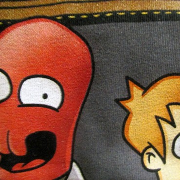
 Panuccis Express T-Shirt Design by RyanAstle Close Up NeatoShop Print Quality Review
 Panuccis Express T shirt Design by Ryan Astle TAG NeatoShop Print Quality Review
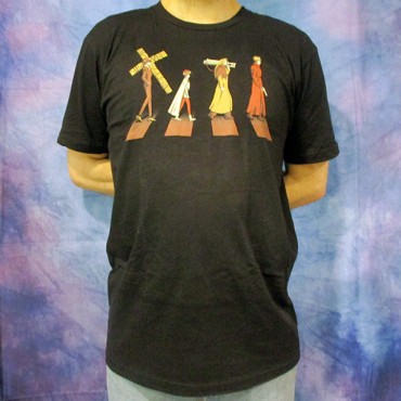
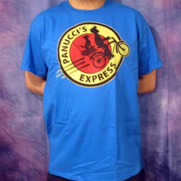 Panuccis Express T shirt Design by Ryan Astle WORN NeatoShop Print Quality Review
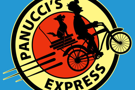
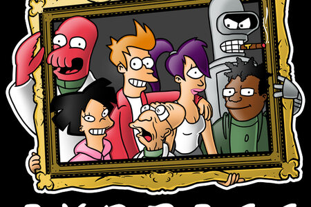
The Panucci's Express tee design is for the true Futurama fans.
For starters, the concept is that the logo of Planet Express is reworked retrospectively into a logo for Panucci's Pizza featuring Fry and Seymour instead of Old Bessie. Also, it might even be a slight nod to E.T. as well. Since the bike is moving up at an angle. But then again, so does Old Bessie. On another note, there is a design circulating with the same graphic with the text Panucci's Pizza sold The Dude's Threads and some others. Therefore, I'm not scoring for originality or creativity. But rather the concept alone. Not to mention the feels this tee brings.
As for the artwork... Firstly, the style is straight up Futurama's style. So no real creative juices there either. However, the use of the meta use of a one Futurama logo with another episode reference from Jurassic Bark in the "pastorama" is cleverly done. But no more so than the "Panucci's Pizza" version. Secondly, the printed colors are bold and simple and work with any fabric color choice. Which is true to the original Planet Express logo. Lastly, negative line work is good, easily separating the elements of the dog and the bike's rear rack elements. Whoever designed it.
This Panucci's Express T-shirt will make a nice gift for the Futurama fans.
Wear this tee to Comic-Cons and when craving pizza.
Panucci's Express Tee Design by RyanAstle.
Is available on T-shirts, Hoodies, Posters, Dog T-shirts, Tank tops and Crewnecks. There are many fabric color options. The review breakdown is as follows:
 Stampede T shirt Design by ADHO1982 Close Up NeatoShop Print Quality Review
 Stampede T shirt Design by ADHO1982 TAG NeatoShop Print Quality Review
 Stampede T shirt Design by ADHO1982 Worn NeatoShop Print Quality Review
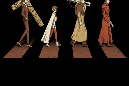
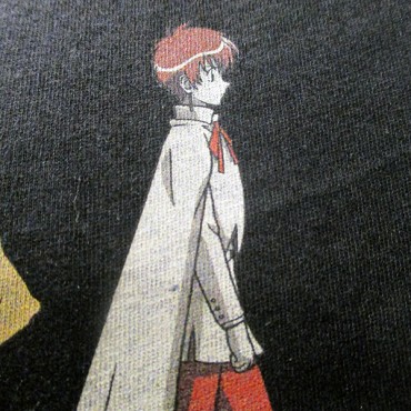
 Friends Express T Shirt Design by Mitch Ludgwig Close Up NeatoShop Print Quality Review
 Friends Express T Shirt Design by Mitch Ludgwig TAG NeatoShop Print Quality Review
 Friends Express T Shirt Design by Mitch Ludgwig WORN NeatoShop Print Quality Review
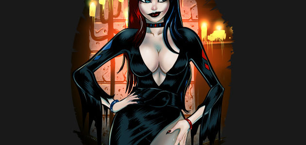
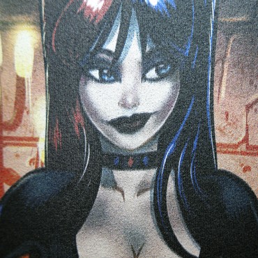 Elvira Quinn Mistress of Mayhem Shirt Design Close Up TeePublic Print Quality Reivew
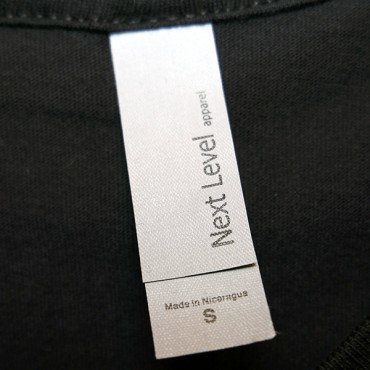 Elvira Quinn Mistress of Mayhem Shirt Design TAG TeePublic Print Quality Reivew
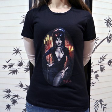 Elvira Quinn Mistress of Mayhem Shirt Design Worn TeePublic Print Quality Reivew
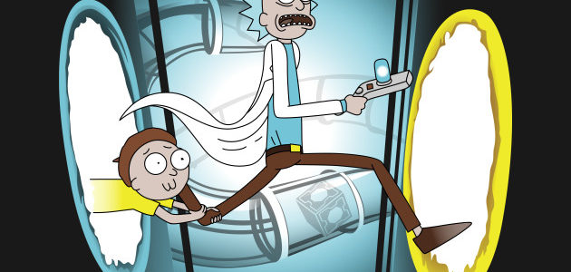
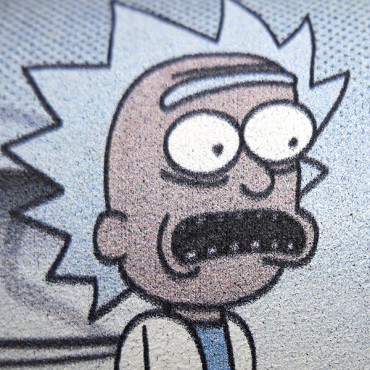 Rick and Porty Shirt Design Close Up TeePublic Print Quality Reivew
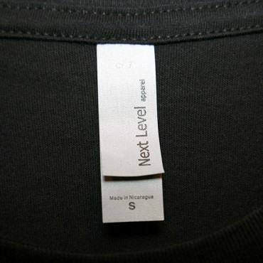 Rick and Porty Shirt Design TAG TeePublic Print Quality Reivew
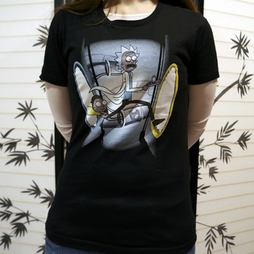 Rick and Porty Shirt Design Worn TeePublic Print Quality Reivew