 Queens of New York Tshirt Design Close Up Ript Apparel Print Quality Review
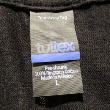
 Queens of New York Tshirt Design TAG Ript Apparel Print Quality Review
 Queens of New York Tshirt Design Worn Ript Apparel Print Quality Review
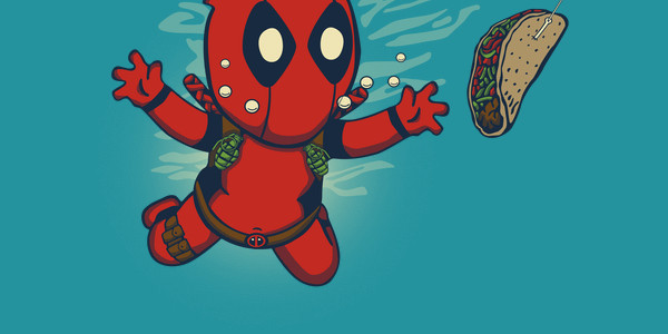
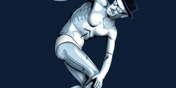
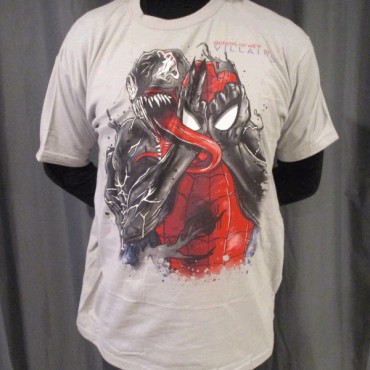
The QUEENS OF NEW YORK T-shirt design is for the Queens of the Stone Age fans.
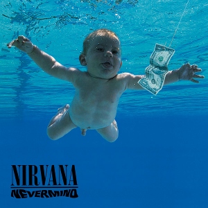
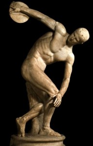
The concept is a Marvel inspired parody of the Queens of the Stone Age Villains Album art (Shown below).

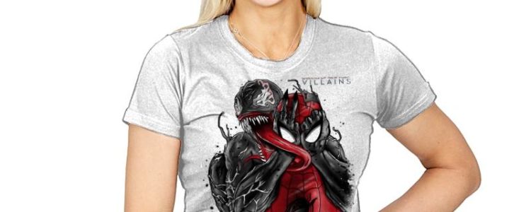
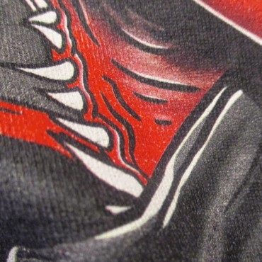
As for the artwork, it stays true to both franchises. As you can see there is plenty of action as evident with Venom's tongue and the splatter effect. Also, check out the awesome shading and details which bring depth to these characters. Let's not forget about the colors as they really pop on any available fabric color choice.
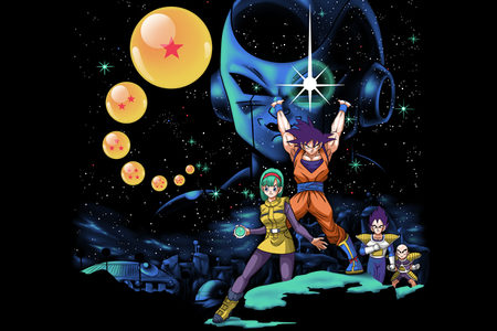
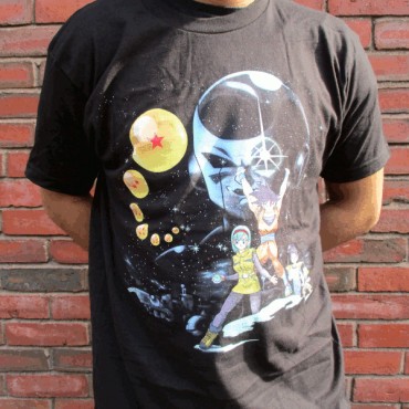
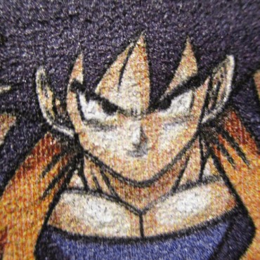 Dragon Wars Z T Shirt Design Close Up Ript Apparel Print Quality Review
 Dragon Wars Z T Shirt Design TAG Ript Apparel Print Quality Review
 Dragon Wars Z T Shirt Design Worn Ript Apparel Print Quality Review

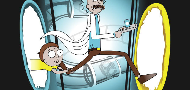
 Rick and Porty Shirt Design Close Up TeePublic Print Quality Reivew
 Rick and Porty Shirt Design TAG TeePublic Print Quality Reivew
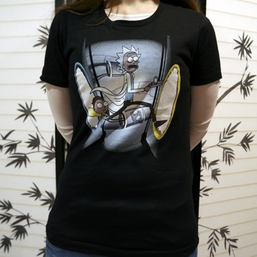 Rick and Porty Shirt Design Worn TeePublic Print Quality Reivew