North Park Tee Design by Theduc.

North Park Tee Design Review.

THIS DESIGN IS NO LONGER AVAILABLE FROM THIS RETAILER.

The North Park tee design is for the Game of Thrones and South Park fans. Even though South Park did a mean parody of Game of Thrones in the Black Friday episode making fun of it (like they do everything else). This mash up parody is just as funny and awesome.

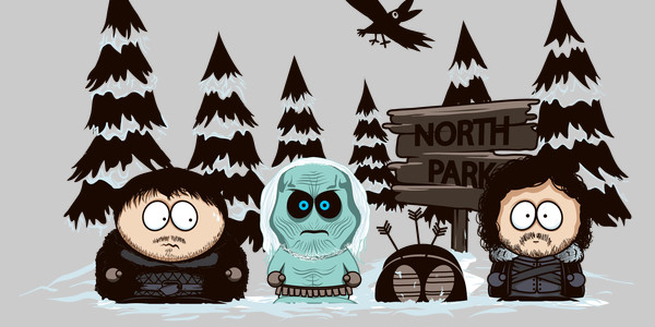
The concept is simply re-imagining the four main South Park kids and their school bus stop with a Night's Watch theme. Of course fatass Cartman is Samwell Tarly, Kyle as a White Walker (the angry eyes is definitely Kyle), Kenny as a corpse and Stan as Jon Snow. The South Park sign has been replaced with a North Park sign for more of a Game of Thrones vibe.

As for the artwork, the style is emulating South Park's style flawlessly. The colors and lack of shading couldn't be a better a match. The layout is taken from any bus stop scene featuring the South Park boys. The way the Game of Thrones character likenesses were applied does both franchises justice. The true to shows' facial expressions make this design what it is, had any of that been changed the design would had sucked. The crappy looking South Park style raven even fits in nicely fora smooth transition.

This North Park tee will make a nice gift for the Game of Throne fans (especially of Jon Snow).

Wear this tee to Comic-Cons and fantasy conventions. This is a fifty fifty mash up so fans of both franchises will be happy to add this to their collections. This probably isn't appropriate as school clothes for children though since both South Park and Game of Thrones are meant for mature audiences.

North Park Tee Design by Theduc.

Is available on T-shirts, Hoodies, Tank tops, Posters, Dog T-shirts and Crewnecks. As for the fabric color options there are many choices but no Black for this particular design. The review breakdown is as follows:
Pleased To Meet You Tee Design by RicoMambo.

Pleased To Meet You Tee Design Review.

THIS DESIGN IS NO LONGER AVAILABLE FROM THIS RETAILER.

The Pleased To Meet You tee design is for the Game of Thrones and Star Wars fans that geek out over both of the franchises equally.

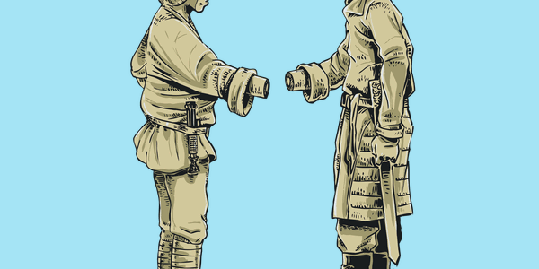
The Pleased To Meet You tee design concept is simply drawing on the many parallels between Luck Skywalker and Jaime Lannister. In this design the two meet rather awkwardly. So WARNING SPOILER ALERT! First off, both strapping young lads have a thing for their own sisters. Second, both men have major daddy issues. Those may not be evident in this design but it part of the pairing. Third, they are both of noble blood. Fourth, both are trained swordsmen. Fifth, they both lose a hand. Finally(?), they both go through trials that shape their character for the better.

As for the artwork, it is sketchy but solid. The characters look kind of like statues minus some stone textures as the coloring is flat with the skin and clothing being the same color for each character. There is some minor shading and the likeness of each would definitely give away who is who even without the exchanged names (dialogue).

While this tee is awesome, I hope to see a more detailed version of this design in the future by RicoMambo. The concept is a very layered mash up and is respectful to both franchises.

This is a must have tee for fans of both franchises.

Pleased To Meet You Tee Design by RicoMambo.

Is available on T-shirts, Tank Tops, Hoodies, Long Sleeves, Sweatshirts and Dog T-shirts. Ice Blue (Best Choice), Kiwi Green, Silver, Turquoise and White are the available fabric color choices. The review breakdown is as follows:
http://www.neatoshop.com/product/Go-Home-Hat-youre-Drunk

Go Home Hat You’re Drunk Tee Design Review.

THIS DESIGN IS NO LONGER AVAILABLE FROM THIS RETAILER.

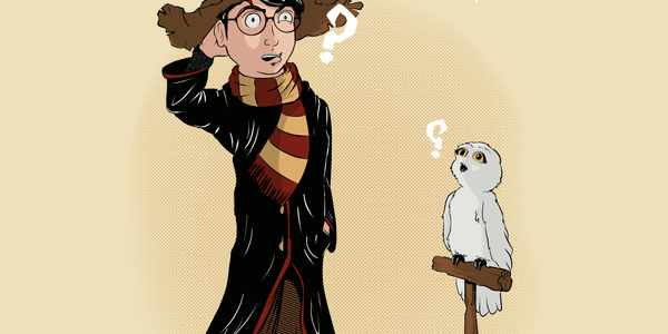
The Go Home Hat You're Drunk tee design is for Harry Potter Fans fans and to a lesser extent fans of Game of Thrones.

The Go Home Hat You're Drunk tee design concept is that Harry Potter belongs in House Stark of Game of Thrones. It is rather amusing. I actually laughed out loud for a good seven seconds or so when I first seen it. The idea itself is brilliant.

As for the artwork, The illustration and coloring is nice. However there are two things that might bother some people. First, there is one tiny dot out form Harry's elbow that is just there, so CREAM is the best color for this design. No one else would notice it. Second, the spotlight is weird looking with the edges on both sides being asymmetrical and well... lazy. The shading isn't consistent either. Again, probably no one but me pays this much attention to the details in t-shirt designs. It is a bit weird to see a House Sigil inside a dialogue balloon instead of words.

Game of Thrones fans and some Harry Potter fans would want this tee in their collection, especially if they like of both franchises.

Go Home Hat You're Drunk Tee Design by Lithium.

Is available on T-shirts, Tank Tops, Hoodies, Long Sleeves, Sweatshirts and Dog T-shirts. There are many fabric color choices available. However this is one of the rare occasions when the choices should be limited. It actually looks better on the lighter colors such as CREAM for reasons mentioned in the art critique above. So seriously take that into consideration if you get this design. The review breakdown is as follows:
Why Not Zoidberg Tee Design Review.

THIS DESIGN IS NO LONGER AVAILABLE FROM THIS RETAILER.

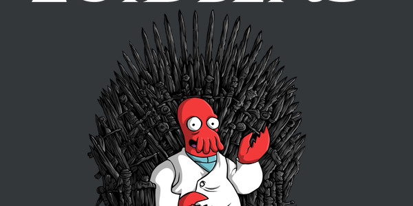
The Why Not Zoidberg tee design is for the people that decide which they like more, Game of Thrones or Futurama.

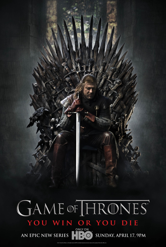
The concept is playing on a popular Futurama meme "Why Not Zoidberg", which is something that Zoidberg never actually said and the Game of Thrones poster from season 1 (shown below). The idea is that Zoidberg could rule Westeros as King just as well as anyone else.

Game of Thrones Season 1 Poster

As for the artwork, it is clean, well colored and well shaded. The style of the Iron Throne is like the perfect blend of both franchises. The only fail is a lack of a question mark. I will not deduct stars for that, in hopes that the artist updates the design.

Game of Thrones and Futurama fans would want this tee in their collection, especially if they like of both franchises.

Why Not Zoidberg Tee Design by Firebeard.

Is available on T-shirts, Tank Tops, Hoodies, Long Sleeves, Sweatshirts and Dog T-shirts. Black and Charcoal are the fabric color choices. The review breakdown is as follows:
Starry Night's Watch Tee Design By Twenty27.

Starry Night’s Watch Tee Design Review.

THIS DESIGN IS NO LONGER AVAILABLE FROM THIS RETAILER.

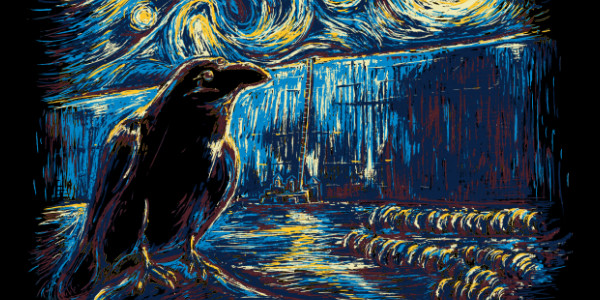
The Starry Night's Watch tee design is for the Game of Thrones fans that enjoy the art of Vincent van Gogh.

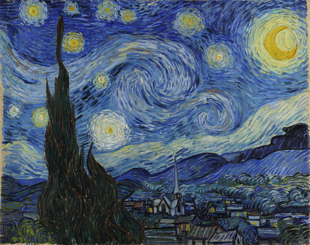
The concept is a fitting mash up as the Starry Night sky is the perfect backdrop for The Wall. This is one of the better Starry Night parodies and mashups in the world. Most of the good ones are done by Girardin27 or Twenty27 (same designer but two different names) such as this one.

Starry Night by Vincent van Gogh

As for the artwork, the style is emulating Vincent van Gogh's obviously with the broad stroke swirls and colors from the moon and stars, but the reimagined Wall from Game of Thrones and the Three Eyed Raven is all Twenty27. The Three Eyed Raven looks like it belongs in the original painting or that it should be the style in which Game of Thrones is expressed (like if it was a comic book or cartoon it would be a good fit). The overall mood is just right...nay perfect for the story. The iridescent effect of the feathers lends itself particularly well to this style.

This Starry Night's Watch tee will make a nice gift for the Game of Throne fans (particularly of the Starks) that look forward to the bigger picture more than the petty squabbles of one House or another (Which are all great entertainment as well).

Wear this tee to Comic-Cons, fantasy conventions and to art museums.

Starry Night's Watch Tee Design by Twenty27.

Is available on T-shirts, Hoodies, Tank tops and Crewnecks. Black fabric color is mandatory. Dark Blues would had been nice as an option. The review breakdown is as follows:
Mother of Dragon Charms Tee Design by djkopet

Mother of Dragon Charms Tee Design Review.

THIS DESIGN IS NO LONGER AVAILABLE FROM THIS RETAILER.

The Mother of Dragon Charms tee design is for Game of Thrones fans and to a lesser extent fans of Harry Potter.

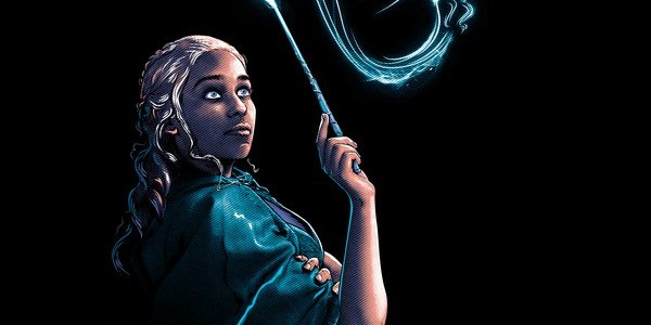
The Mother of Dragon Charms tee design concept is simply giving Daenerys Targaryen a wand (calm down fellas) and thus making her a witch and watching her create dragon illusions through magic. Harry Potter style. It is a simple and elegant idea.

To summon her magical guardian, the witch needed only to concentrate, with all her might, on a single, very happy memory. Would she recall the thrill of watching her brother finally crowned... or the feeling of freeing an entire enslaved city? No... for the Mother of Dragon Charms, the happiest memory of all was the first time she heard the cries of her babies.

As for the artwork, it is flawless. From the coloring and shading to the layout. The colors are complementary. The character likeness is uncanny. If it is true that "the eyes are the windows to the soul" then we can see everything there is to the Khaleesi here as her eyes are illuminating. The details in the dragon and in her lips could be entire designs in their own right. Few people it seems can draw hair right but djkopet nailed it.

I am not that much of a Harry Potter fan (I have nothing against Harry Potter by any means, I just like other fandoms better) but I cannot complain about anything about the concept or artwork. It looks cool and seems like it fits naturally as if it is one story or one universe. It is respectful to both franchises and somehow this mashup works beautifully. There is nothing cheesy about it as one might expect.

Game of Thrones fans and some Harry Potter fans would want this tee in their collection, especially if they like of both franchises.

Mother of Dragon Charms Tee Design by djkopet

Is available on T-shirts, Tank Tops, Hoodies, Long Sleeves, Sweatshirts and Dog T-shirts. Black, Charcoal, Military Green, Navy and Dark Chocolate are the fabric color choices. The review breakdown is as follows: