MONTOYA DETENTION Tee Design by Saqman.

Montoya Detention Tee Design Review.

The Montoya Detention tee design is a The Princess Bride tee for the fans of The Simpsons chalkboard gag.

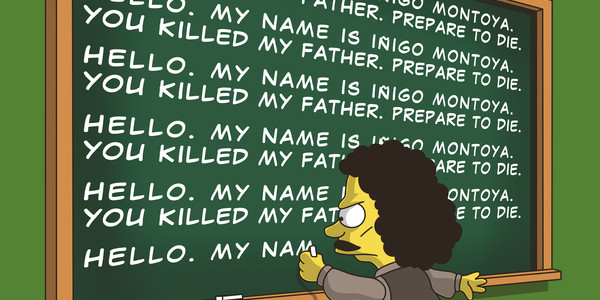
As for the concept, the Montoya Detention tee design is a mash up that plays on both Bart Simpson's detention punishment of writing on the chalkboard and Iñigo Montoya's little introduction/taunt that he's been practicing for years. "Hello. My name is Iñigo Montoya. You killed my father. Prepare to die." The repetition theme is a common element in both.

This is done in The Simpsons drawing style and depicts Iñigo as the one writing on the chalkboard. The clothing is all Iñigo. But the face is a good blend of both Bart and Iñigo. The coloring is great and better than most of the other Simpson's parodies out there by far, as is the shading. The details that are added here like the chalkboard being a darker green around the edges than in the center. Even the character's own shadow matches his shape and is not just a circle or spot on the floor.

Fans of either franchise could go for this shirt. But The Princess Bride fans would definitely be the main target here due to the quote.

Montoya Detention Tee Design by Saqman.

Is available on T-shirts, Tank Tops, Hoodies, Long Sleeves, Sweatshirts and Dog T-shirts. There are a few color choices available as well, each depending on what style is chosen. The review breakdown is as follows:

Nebeermind Tee Design by Melonseta.

Nebeermind Tee Design Review.

The Nebeermind tee design is for Futurama fans that enjoy Nirvana and beer.

This design is based off of Nirvana's Nevermind album cover art (shown below). It depicts a baby Bender instead of a naked human baby. It is a funny mash up that represents the beginning and end of the 90's decade wonderfully. The concept would had worked whether they replaced the dollar with a beer or not since Bender was always stealing cash just as much as he was drinking. He can't resist either at least not for long. This is a good mashup and it is better than a large portion of the other mashups out there because it actually took some thought to produce.

Nirvana Nevermind Album Cover.

So the artwork is a cartoon parody of the Nevermind album cover. The colors and shading are ideal because just as the photo of the underwater baby had light and water patterns under him so does Bender in the form of a brighter hue than his traditional Foghat Gray. The water is simplified with adequate water wave effects, which prevents it from looking too cluttered and busy. Leaving the actual water color whatever the fabric color choice is. There is no fishing line so that is disappointing to some degree but not enough for me to detract any stars.

This is a good shirt for Generation X, fans of grunge and of Futurama the greatest cartoon of all time. Even if a person is just 1 out of the 3 they would still dig this design.

Nebeermind Tee Design by Melonseta.

Is available on T-shirts, Hoodies, Long Sleeves, Sweatshirts and Dog T-shirts. Many fabric colors are available. The review breakdown is as follows:

I Aint Afraid of No Demons Tee Design by Nicko Designs.

I Ain’t Afraid of No Demons Tee Design Review.

The I Ain't Afraid of No Demons tee design is for the Supernatural and Ghostbusters fans.

This concept is not that original or creative as it is an obvious connection that many designers like to do since both franchises have characters that hunt down ghosts, monsters and dead things. But this version of the mashup is better executed than the other ones I've seen so far. The Supernatural crew replaces the Ghostbusters' cast but keeps Ghostbusters uniforms. The Ghostbusters' weapons replace the Supernatural ones.The Muon Trap has a Devil's trap symbol on it. Sam's and Castiel's legs and stances seem a bit off as something doesn't look right. But other than that this shirt is solid.

Ghostbusters

As for the artwork, it has great colors and is drawn quite well. There isn't much for shading (at least for the faces) which really isn't needed in this case but it wouldn't hurt if done right.

This I Ian't Afraid of No Demons tee will make a great gift for Supernatural and Ghostbusters fans. It's a great 50/50 mash up.

This design is ideal to wear while watching Supernatural obviously or while attending Comic-Cons.

I Ain't Afraid of No Demons Tee Design Nickos Designs.

Is available on T-shirts, Hoodies, Long Sleeves, Sweatshirts and Dog T-shirts. Black or Navy Blue are the available fabric color choices. The review breakdown is as follows:

Mr White Walker Tee Design by Spicy Monocle

Mr White Walker Tee Review.

THIS DESIGN IS NO LONGER AVAILABLE FROM THIS RETAILER.

The Mr White Walker tee design is for the Game of Thrones and Breaking Bad fans because.

This concept is a play on Walter's surname being White and the cold ass zombie things North of the Wall from Game of Thrones called White Walkers. That and Mr. White's heart is cold as ice. Both are villains. They both know a thing or 2 about "ice". So it works on a few levels.

White Walker

As for the artwork, it blends Walter's face with that of a White Walker. It looks like the Threshold function of Photoshop was used in the creation of this design. There is no color to this tee except for the solid Blue used for the irises. It would had looked better if some rods and cones were added to the eyes using some other Blue hues. There is shading but there is no gradients hence my "threshold" comment. The graphic is simple and straightforward. Making it a clean design that is ideal for a tee. Not a lot of detail but a lot is not needed.

Like other Breaking Bad or even Game of Thrones tees. I wouldn't recommend it as a school garment as it's not appropriate for kids.

Wear this tee to a Comic-Con or wherever you'd like to stir up a conversation about either show.

Mr White Walker Tee Design by Spicy Monocle.

Is available on T-shirts, Hoodies, Long Sleeves, Sweatshirts and Dog T-shirts. Black is the only fabric option, which is appropriate but Navy Blue or Midnight Blue would had been nice too. The review breakdown is as follows:

I WANT TO BELIEVE 100 YEARS Tee Design by Fishmas

I Want To Believe 100 Years Tee Design Review.

The I Want To Believe 100 Years tee design is for Sci-Fi fans that enjoy Rick and Morty and the X-Files.

The concept of this design is based on the show Rick and Morty (clip shown above) and the poster "I Want To Believe" that could be seen in "Spooky" Fox Mulder's F.B.I. office. It is also the title of the second feature film installment of the X-Files franchise. The design has Rick and Morty flying in Rick's Ship at one of the many dimensions that they travel to during their crazy adventures. Wubba Lubba dubb dubb!

As for the artwork, there is nothing particularly special. There is nothing bad about it. It looks good. Even the coloring and shading are okay, even though the Rick's Ship and the characters should be shaded completely to match the lighting on the silhouettes of the tree things. It is done this way to show the characters mope clearly. After all, the cartoon is crudely drawn to begin with so why make them obscure? That would make fora crappy design. As it is, it's basically just an image from the cartoon even if it is drawn completely by Fishmas as Rick and Morty is still not his creation. It is cool though. Typically, rectangular designs suck unholy ass on a T-shirt. But this one works as it is parodying a poster. Add the phrase "I Want To Believe" and suddenly it becomes a kickass mashup.
Any Rick and Morty fan will want this this tee whether they like the X-Files or not.

This design is offered on kids' tees too even if the show is inappropriate for young ages.

I Want To Believe 100 Years Tee Design by Fishmas

Is available on T-Shirts, Tank, Crewneck, Kids, Long Sleeve, Hoodie, Baseball Tee and as a Print. Many fabric color choices are available depending on which style of garment is chosen. The review breakdown is as follows:

Where's Walt Tee Design by Harantula

Where’s Walt Tee Review

The Where's Walt tee design is for the Breaking Bad fans that thought mashing Walter White up with Where's Waldo would be a good and funny idea. Guilty!

This concept is solid. It has an awesome balance of Waldo and Walter elements. Waldo Shirt, Walter underpants. Waldo glasses and head shape, Walter's facial features. The Hazmat Jumpsuit and shovel, pink teddy bear, Blue Sky, Los Pollos Hermanos rubber chicken, gas mask, shades, pork pie hat and ricin filled cigarette in a pack are nice little extras. But the big barrel of money with the words "Where's Walt" and "The Meth Journey" is just generous. It is based on the episode where Walt goes on the run from the law in the entitled Granite State.

As for the artwork, Harantula did a good job making Waldo look Walt like. The colors are great and the shading is good enough though not complete. The Waldo pose is what delivers this tee to awesomeness.

A funny tee for any Breaking Bad tee that grew up that enjoyed the Where's Waldo books and cartoon.

Where's Walt Tee Design by Harantula.

Is available on T-shirts, Hoodies, Long Sleeves, Sweatshirts and Dog T-shirts. There are a few fabric colors to choose from. The review breakdown is as follows:

Forever Young Tee Design by Nasken

Forever Young Tee Design Review.

The Forever Young tee design is a mash up that comes to everyone's mind at some point or other Link and Navi with Peter Pan and Tinkerbell.

The concept is okay. Link and Navi are solid with their shadows taking the shape of Peter Pan and Tinkerbell. I'm not sure if anything else is being implied or not. Surely no one thinks there is any copyright infringement of any kind by Nintendo. Both sets of characters have many similarities. Link and Peter Pan are both heroes and are roughly the same ages most of the time (kids). They both wear green clothing and have their weapons of choice. Navi and Tinkerbell are both fairies that follow their boy in green around everywhere.

As for the artwork, it isn't bad. It has appropriate colors and moderate shading. The stance is a bit off for the shadow to be properly aligned so it is forced for the sake of the concept.

This is a good "green tights club" Zelda themed tee that kids of all ages should love.

This casual shirt is good for getting double takes.

Forever Young Tee Design by Nasken.

Is available on T-shirts.

Many fabric colors are available. The review breakdown is as follows:

A Very Long Time Ago Tee Design by Vintz.

A Very Long Time Ago Tee Design Review.

The A Very Long Time Ago tee design is for Star Wars and Gremlins fans.

This concept is effing hilarious and clever. If you have ever wondered what the love child of Yoda and an Ewok would look like, this is it. Whether you wanted to think about that or not. But that is not the funniest or even most disturbing part. Check out how creepy Yoda looks with his bulging eyes and old man pipe. It's like viewing one of those post-mortem photos. Add all of those elements together and behold, one of the greatest pop culture tees of all time. If this tee looks familiar, it is because the design used to be sold at Threadless... (Also) a long time ago.

As for the artwork, it is drawn in a cartoon style that is made up to look like an old early photograph from the Victorian Era. Think Conté Crayons on cardboard. The shading and highlights are superb. The facial expressions are on par with damn near all the old time portraits. Probably because people had to be still for a long time for the photographic plates to be exposed. At first, it took roughly 15 minutes. Then just a couple years later it was down to a couple of minutes. Which is still a long time to have to strike a pose. That and people back then were ashamed of their teeth due to the lack of dental care and hygiene. Either way, Vintz nailed it.

This tee is for any Star Wars and Gremlins fans or at least of the cute Mogwai form.

Wear this tee everywhere that tees are appropriate. It would make a great conversation starter at Comic-Cons and Sci-Fi conventions.

A Very Long Time Ago Tee Design by Vintz.

Is available on T-shirts, Hoodies, Long Sleeves, Sweatshirts and Dog T-shirts. Dark Chocolate fabric color is mandatory for tees, Black for Sweatshirts. Dark Chocolate is a good choice because it gives the design the nostalgic Sepia photo appearance. The review breakdown is as follows:

Sword Of The Master Tee Design by TeeKetch

Sword of the Master Tee Design Review.

The Sword of The Master tee design is for the people that like the stories of young heroes and adventure. Especially, if they happen to be a young King Arthur or Link. Which this tee is based on both.

The concept is good and the style is on par with The Sword In The Stone cartoon. Both have a Sword in the stone (or anvil) in their storylines.

As for the artwork, the colors is good and the shading is minimal. The textures of the anvil, gateway and ground are done with simple splotches. It looks like old VHS cover art. The art and text are done in the Sword In The Stone drawing style.

This Sword of the Master tee will make a nice gift for the fantasy and RPG lovers. The ones that are Legend of Zelda fanatics and those who love The Once and Future King or The Sword In The Stone will wear this Sword of the Master tee like it was their skin.

This is a good casual shirt that fits in anywhere such as Comic-Con or while gaming.

Sword of the Master Tee Design by TeeKetch.

Is available on T-shirts, Hoodies, Tank tops and Crewnecks. Navy Blue colored fabric is mandatory. The review breakdown is as follows:

Busted Ghost Tee Design by Naolito.

Busted Ghost Tee Design Review.

The Busted Ghost tee design is for the Pac-Man and Ghostbusters fans.

The concept is far from original as there have been various Ghostbusters and Pac-Man mash ups and parodies. This one uses the ghost trap as a coffin. Speedy aka "Pinky" is the ghost in the coffin but the character is shown as a dark blue. This is because when Pac-Man eats a power pellet the ghost turn blue then they can be chomped. However, once chomped they no longer have their "sheet" or color as they just roam around as floating eyes. This was done this way because eyes only would look weird in a coffin. The best part of this design though and by far the funniest thing about it is how Shadow aka "Blinky" stares at the coffin like he knows something is not quite right.

As for the artwork, it is a decent illustration but it isn't perfect. For starters, where is the other lid flap and hinges for the coffin? At first glance people might not notice that it is missing. Some may never notice. Second, the shading is great except the lighting on the ghost in the trap is different. It is just a cartoon type design so it really doesn't matter so much but I notice it. IT was done that way to show the contour of Pinky because that is the only visible side. Illustrators often break the rules of physics to force a perspective. It does however look good, it has great coloring. The layout is perfect. the middle ghost Pokey aka "Clyde" is raised a little in order to have him stand behind the others so they aren't in a perfect straight line. Making it look more natural and overall better than lined up like ducks in a row. Each ghost also has their own facial expression.

This Busted Ghost tee will make a good gift for Pac-Man or Ghostbusters fans. Basically anyone that was around in or at least born in the 80's will appreciate it.

There are no Kids' tees for this design from this retailer so it gets docked for that.

Wear this tee anywhere and everywhere that tshirts are socially acceptable.

Busted Ghost Tee Design by Naolito.

Is available on T-shirts. Black Fabric is Mandatory. The review breakdown is as follows: