I Want To Believe Tee Design by Cubik and ZombieMedia

I Want To Believe Tee Design Review.

The I Want To Believe tee design is for Sci-Fi fans that enjoy Back To The Future and the X-Files.

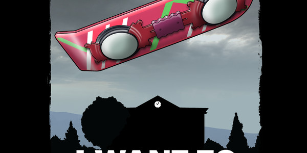
The concept of this design is based on the Back To The Future Hoverboard and the poster "I Want To Believe" that could be seen in "Spooky" Fox Mulder's F.B.I. office. It is also the title of the second feature film installment of the X-Files franchise. An actual hoverboard has been the dream of almost everyone that has seen the Back To The Future II and III movies not just the fanboys. WE ALL WANT TO BELIEVE. So much so that two variations of the hoverboard have been made this year to match the deadline in the movie... the Hendo Board and the Lexus Hoverboard. Though neither are as tweaked out or perfected as the one in the movies.

As for the artwork, there is a good full colored illustration of the fictional Mattel Hoverboard in the foreground with a silhouetted Hill Valley Courthouse in the background. Awesome coloring and contrast. Personally I think it is a little weird to see just a hoverboard without a pair of legs attached to it, but that is just me.

The 80's children would probably love this tee as the Back to The Future movies are iconic.

This is a good BTTF tribute tee as this is the year (2015) that the Marty McFly character traveled to in the in the Back To The Future II movie.

I Want To Believe Tee Design by Cubik and Zombiemedia

Is available on T-shirts, Hoodies, Long Sleeves, Sweatshirts and Dog T-shirts. Many fabric color choices are available depending on which style of garment is chosen. The review breakdown is as follows:

Hear Me Roar Tee Design by Alberto Arni.

Hear Me Roar Tee Design Review.

THIS DESIGN IS NO LONGER AVAILABLE FROM THIS RETAILER.

The Hear Me Roar tee design is for Game of Thrones fans and those that have fond memories of The Lion King.

For the concept, The Hear Me Roar tee design corrupts the Game of Thrones world with the evilness of Disney's The Lion King. But it looks damn good. The Lion is the sigil for the House of Lannister and putting Tyrion on a cliff with two other famous lions is a fun idea. It has the right balance of cute and funny as well as all the needed references to make a good mashup or parody.

As for the artwork, the shading, lighting and coloring are all fantastic. It looks like a still from a large production Disney animated movie. It has loads of stunning detail and effects. Especially with the use of the simulated sunlight. It looks really good on a red tee.

As a result, this is one of the best parody tees.

This is an fun Game of Thrones shirt that is bound to bring laughs to many fans.

Writing as someone that is not a fan of The Lion King or of Disney in general, the Game of Thrones fans would still like this tee. But die hard Disney fans would only like this if they like Game of Thrones.

Hear Me Roar Tee Design by Alberto Arni.

Is available on T-shirts, Tank Tops, Hoodies, Long Sleeves, Sweatshirts and Dog T-shirts. There are 3 fabric color choices available, White, Black and Red. The review breakdown is as follows:

Dawn of Gaming Tee Design by Naolito

Dawn of Gaming Tee Review.

The Dawn of Gaming tee design is for the Donkey Kong fans that dig science fiction movies such as 2001: a Space Odyssey.

The concept replaces the man apes and monolith of 2001: A Space Odyssey with Donkey Kong and an original NES controller. Which is a great idea but the fact that Donkey Kong is wearing his trademark tie and that there are barrels around implies that he is already familiar with some sort of technology. This defeats the point of the monolith aspect as it is supposed to be the first technology of any kind that is witnessed by the man apes. Then again, how else are people supposed to know that it is Donkey Kong right? It is still cool regardless and most people won't analyze the Hell out of the design like I do, so go for it.

2001: A Space Odyssey

As for the artwork, it is professional through and through. Good coloring and shading. The background as awesome as it is with the man apes and all is grayed out providing more focus to Donkey Kong and the controller which are in color.

This Dawn of Gaming tee will make a nice gift for the Nintendo enthusiasts as well as the Stanley Kubrick and Arthur C. Clarke fans.

This is a good gamer and Sci-Fi shirt that fits in anywhere such as Comic-Con or to rock concerts.

Dawn of Gaming Tee Design by Naolito.

Is available on T-shirts, Hoodies, Tank tops and Crewnecks. Asphalt fabric color is mandatory. The review breakdown is as follows:

All Characters Must Die! Tee Design by Profetta999

All Characters Must Die! Tee Design Review.

THIS DESIGN IS NO LONGER AVAILABLE FROM THIS RETAILER.

The All characters must die! tee design is a Game of Thrones tee for the fans of The Simpsons chalkboard gag.

As for the concept, the All characters must die! tee design is a mash up that plays on both Bart Simpson's punishment and Arya Stark's revenge list sleep mantra. The repetition theme is a common element for both characters. It is not the first time or the last time that these two franchises will be mashed up but this is the best and most obvious design to come from the combination so far.

This is done in The Simpsons drawing style and depicts Arya as the one writing on the chalkboard. The clothing is all Arya. But the face doesn't really look like her even if it is a Simpsonized version. As it just looks like Bart in a wig with eyelashes. But it does deliver the gag across. It is not worth taking away stars by nitpicking about which character's facial features should be dominate as that is just artistic preference.

Fans of either franchise could go for this shirt. But Game of Thrones fans would definitely be the main target here due to the list of names.

Now if only we can hear Danny Elfman play the Game of Thrones theme song.

All characters must die! Tee Design by Profeta999.

Is available on T-shirts, Tank Tops, Hoodies, Long Sleeves, Sweatshirts and Dog T-shirts. There are many fabric color choices available as well, each depending on what style is chosen. The review breakdown is as follows:

Armored Maiden Tee Design by Ninjaink.

Armored Maiden Tee Review.

The Armored Maiden tee design is for the Metroid fans that dig the awesomeness of the metal band Iron Maiden.

So instead of the band name "Iron Maiden" there is "Armored Maiden" which is making use of the actual definition of the term "Maiden". The concept is cool and much like the Galactic Empire tee and it makes a much better mash up or parody of Iron Maiden's The Trooper than say the Skeletor version (which isn't bad) or the Mars Attacks version.

Iron Maiden The Trooper Album Cover

As for the artwork, it is epic. It features Samus Aran instead of Eddie and the substituted flag has the breast sigil of Samus's Zero suit instead of the Union Jack. It has the "The Hunter" as the album name instead of the original "The Trooper" which is parodying. Other game elements replace the rest of the album cover such as her crashed ship in place of the canon and various enemies instead of the Grim Reaper in the bottom right corner. All mirroring their counterparts perfectly. The shading and coloring is masterfully done as is expected from Ninjaink.

This Armored Maiden tee will make a nice gift for the Nintendo and Metroid fans. Plus it is available in kid sizes so they won't miss out on this sci-fi and rock legend tribute.

This is a good gamer shirt that fits in anywhere such as Comic-Con or to rock concerts.

Armored Maiden Tee Design by Ninjaink.

Is available on T-shirts, Hoodies, Tank tops and Crewnecks. Many fabric colors are available depending on the style. The review breakdown is as follows:

Beetlebuster Tee Design by Donovan Alex.

Beetlebuster Tee Design Review.

The Beetlebuster tee design is for the Beetlejuice fans that have been waiting for a great fan shirt. While it does incorporate Ghostbusters, it leans more towards the Beetlejuice fandom.

This concept is clever. The phrase "who ya gonna call three times?" paired with Beetlejuice placed inside the backwards prohibition symbol with the words "The afterlife's leading Bio-exorcist" below it, works. Instant classic! What this piece lacks in grammar it more than makes up for it with movie references. Making it a great geek tee.

As for the artwork, it is illustrated well. Beetlejuice looks badass and the ectoplasmic glow effect adds to the the spooky element that was underlying both (dark) comedies. The colors are perfect with great contrast. There is some nice foreshortening going on in the arms. The shading in the face and hair is awesome. While not everyone will agree with this next opinion I stick by it. The fact that the green glow is off center from the Prohibition sign makes the design better. Because his hand extends further on the side where the green is wider.

This Beetlebuster tee would make a great gift for the fans of both franchises but Beetlejuice fans will appreciate it more.

This is another great geek shirt that is perfect for comic-cons and whatever. It is a great October and Halloween tee.

Beetlebuster Tee Design by Donovan Alex.

Is available on T-shirts, Hoodies, Long Sleeves, Sweatshirts and Dog T-shirts. Many colors of fabric is mandatory. The review breakdown is as follows:

WIB Tee Design by mannypdesign.

WIB Tee Design Review.

The Winchesters In Black or WIB tee design is for the "Hunters" or fans of Supernatural and to a lesser extent fans of the MIB or Men In Black franchise.

Another good supernatural design that revolves around their FBI suits that the Winchester brothers wear as they replace the J and K characters of the Men In Black movie poster. Instead of a the mind wiping device that the MIB held, Sam and Dean wield their respective demon hunting knife and trusty Colt handgun. Also, Castiel's silhouette is at the bottom of the letter "I" instead of the silhouettes of the MIB duo.

As for the design, the light coloring and shading are done well. But only on Black fabric, more on this further below.

As for the concept, the serious side of the characters can be seen here in this mash up. It just works. Instead of the hunters of aliens they are hunters of monsters and demons. So therefore, there is not much of a stretch. Both franchises characters dress the same and are or act as "agents".

This WIB tee will make a nice gift for any fan of Sam and Dean and their fight against evil.

This is a good casual shirt that fits in anywhere such as Comic-Cons. It would also make a good tee to wear while streaming Netflix.

WIB Tee Design by mannypdesign.

Is available on T-shirts, Hoodies, Tank tops and Crewnecks. Many fabric colors are available depending on the style but BLACK is the only one that goes with this design, concept and design title. As as the Black fabric makes up most of the design itself. The review breakdown is as follows:

GALACTIC EMPIRE THE TROOPER Tee Design by Mark Welser

GALACTIC EMPIRE THE TROOPER Tee Review.

The Galactic Empire The Trooper tee design is for Star Wars fans that dig the awesomeness of the metal band Iron Maiden.

So instead of the band name "Iron Maiden" there is "Galactic Empire" which is fitting. The concept is great. It makes a much better mash up or parody of Iron Maiden's The Trooper than say the Skeletor version (which isn't bad) or the Mars Attacks version. As it actually has parallels with the "trooper" concept with a Stormtrooper carrying a Galactic Empire Flag in place of Eddie as The Trooper carrying the Union Jack (Shown below). It is definitely one of the best three Iron Maiden derived mash ups that I have seen. At least in the pop culture tee circuits.

Iron Maiden The Trooper Album Cover

As for the artwork, it is beautifully done. To simplify things Mark used a circle to keep the focus on the Stormtrooper rather than the battlefield. Thus eliminating a lot of busy background elements that were in Iron Maiden's actual album cover. While it is difficult to be as badass as Iron Maiden's original cover art, Darth Vader makes an appearance in the corner instead of the Grim Reaper. Thus, bringing it up to par. The coloring, shading, and style is a nice blend of the Star Wars comic books and the album art. Which makes the design work. There is another version of this same concept done by someone else that is just terrible at all three (show below).

First Order Tee Design by DC VISUAL ARTS

This GALACTIC EMPIRE THE TROOPER tee will make a nice gift for the Star Warriors both Jedi or Sith. Plus it is available in kid sizes so they won't miss out on this sci-fi and rock legend tribute.

This is a good casual shirt that fits in anywhere such as Comic-Con or to rock concerts.

GALACTIC EMPIRE THE TROOPER Tee Design by Mark Welser.

Is available on T-shirts, Hoodies, Tank tops and Crewnecks. Many fabric colors are available depending on the style. The review breakdown is as follows:

I Am The One Who Knocks Tee Design by Olipop

I Am The One Who Knocks Tee Design Review.

The I Am The One Who Knocks tee design is for Breaking Bad fans and to some extent The Big Bang Theory fans. However, if you are not a TBBT fan, seeing Sheldon get slapped silly might make this a great tee for you.

This concept for mash up stems from Walter White's line "I Am The One Who Knocks." and the fact that Doctor Sheldon Cooper is always obsessive compulsively knocking on people's doors three times and saying their name once then repeating these actions two more times. Usually on Penny's, Leonard's, or Amy's door. In this case Penny's. I'm not sure why Heisenberg is at Penny's apartment. So that story is anyone's guess. She did know a lot about meth labs in Nebraska.

As for the artwork, it is illustrated well enough that one could almost hear the knock across Sheldon's head. The shading and colors are top notch. Gotta love the motion lines. Only Walter's face is showing as Sheldon's back is to the viewer. It is easy to tell who it is supposed to be because of the hairstyle and the trademark tee shirt over a long sleeved undershirt.

This I Am The One Who Knocks tee would make a great gift for the fans of both franchises.

I wouldn't recommend it as a school garment with obvious violence and the Breaking Bad reference. Other than that, this will make a great cross fandom t-shirt for any casual occasion.

I Am The One Who Knocks Tee Design by Olipop.

Is available on T-shirts, Hoodies, Long Sleeves, Sweatshirts and Dog T-shirts. Black or Military Green colored fabric is mandatory. The review breakdown is as follows:

Bender U.F.O. Tee Design by Firebeard

Bender U.F.O. Tee Design Review.

The Bender U.F.O. tee design is for Sci-Fi fans that enjoy Futurama and the X-Files.

This design is based on the Futurama episode entitled Roswell That Ends Well and the poster "I Want To Believe" that could be seen in "Spooky" Fox Mulder's F.B.I. office. It is also the title of the second feature film installment of the X-Files franchise.

So the artwork is a silhouetted rip of the actual cartoon of Bender from when the U.S. Military put his body back together wrong in the shape of a flying saucer. It is the mashing it up for the "I Want To Believe" poster that makes the design brilliant. Not the actual artwork itself. There many parodies and mash ups of the poster and they are usually all crap or feature a damn TARDIS.

This Bender U.F.O. tee would make a great gift for fans of the FOX Sci-Fi shows such as Futurama and the X-Files. But don't give FOX too much credit, they did cancel Firefly after all.

This is a great shirt to wear to a Comic-Con or wherever geekdom can be found.

Bender U.F.O. Tee Design by Firebeard

Is available on T-shirts, Hoodies, Long Sleeves, Sweatshirts and Dog T-shirts. Black fabric color is mandatory. The review breakdown is as follows: