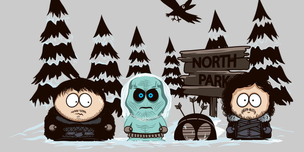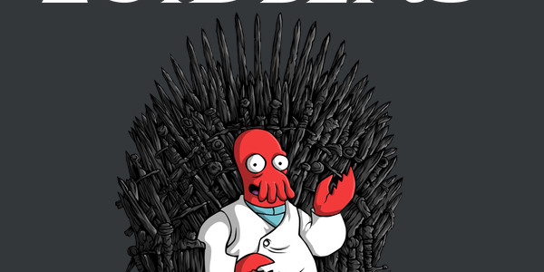
The Game of Coins tee design is for the Game of Thrones fans that grew up watching Ducktales.
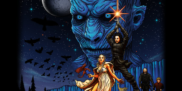
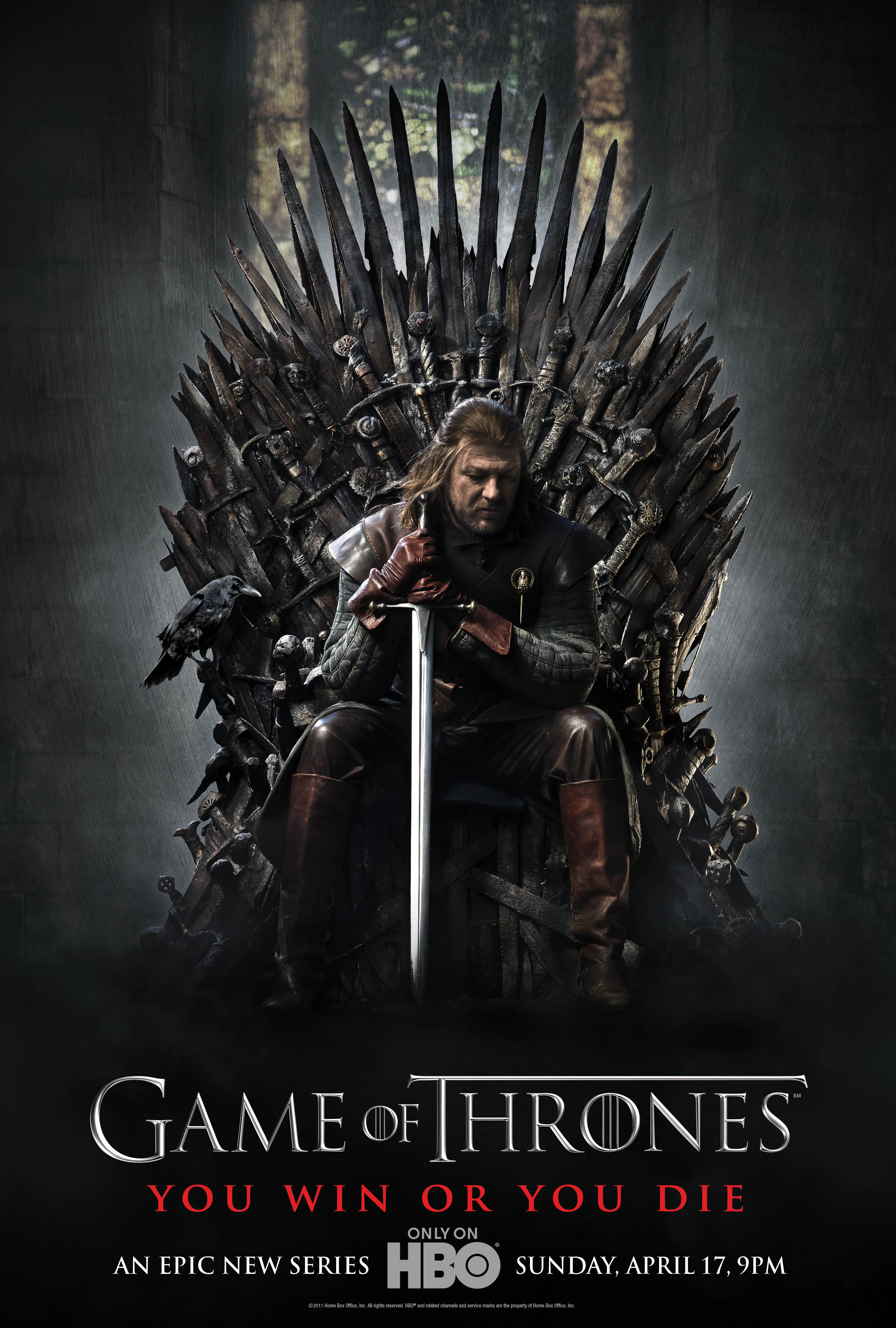
The concept for the Game of Coins tee is that Scrooge McDuck sits up his Golden Throne made of Coins while holding his lucky #1 dime. It is based on the Game of Thrones posters featuring characters such as Ned Stark sitting at the Iron Throne (shown below). Not bad for a silly mash up. It is tied together with the phrase "You're Rich or You're Not" (parody of Game of Throne's "You win or you die").

As for the artwork, Scrooge looks as the Disney brand made him with bold colors and great shading which makes everything look right. From shiny gold to fluffy feathers. The only real criticism is that the dime that Scrooge is holding is a bit difficult to see clearly as it blends in with his face.
This shirt is an awesome Ducktales shirt that can be worn at any casual event. The Game of Thrones reference is strong but this tee is definitely more of a Ducktales prize.


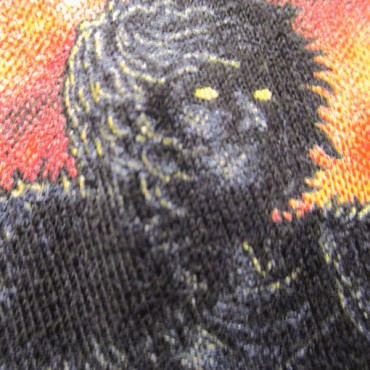 WATCHERS OF THE WALL POP IMPRESSIONISM Tshirt Design Close Up Ript Apparel Print Quaility Review
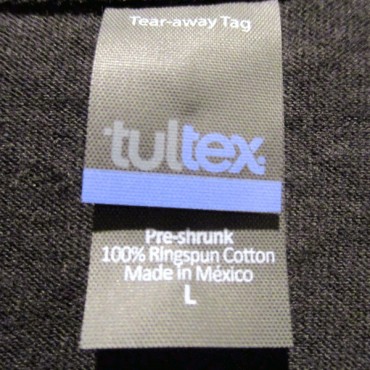 WATCHERS OF THE WALL POP IMPRESSIONISM Tshirt Design TAG Ript Apparel Print Quaility Review
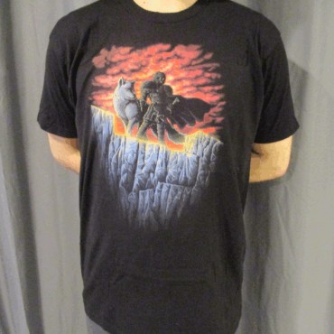 WATCHERS OF THE WALL POP IMPRESSIONISM Tshirt Design Worn Ript Apparel Print Quaility Review