Queen of Moons Tee Design by traceygurney.

Queen of Moons Tee Design Review.

The Queen of Moons tee design is for the nerdy and fans of Supernatural. Nerds need a champion and queen and here the underdog Charlie Bradbury happens to be both.

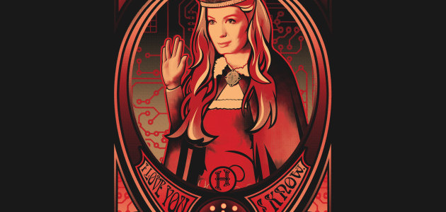
The concept of the Queen of Moons tee is art nouveau style tribute to the Supernatural character Charlie Bradbury (played by Felicia Day) and the LARP and the Real Girl episode. It has many references to her character and pop culture in general. From "I love you I know" (Star Wars), The Vulcan Salute (Star Trek), The White Tree of Gondor (Lord of the Rings), a icosahedron from Dungeons and Dragons and a circuit board pattern. These are the references that I know, there are a couple others in there as well. All really great choices that define her character very well.

As for the design, it is impressive. Some nice 3D shading paired with flat design elements creates an interesting effect which makes art nouveau difficult to do but Tracey nailed it. The Red color which was chosen on account of her hair works great with the theme. The layout is better than most art nouveau pieces. The fact that Charlies crown extends past its would be frame shows strong a artistic mindset with a great lack of respect for restrictions. Depth and interest that is what it is all about.

This Queen of the Moons tee will make a nice gift for any fan of Supernatural and empowered women.

This is a good casual shirt that fits in anywhere such as Comic-Cons. It would also make a good tee to wear while streaming Netflix.

Queen of Moons Tee Design by traceygurney.

Is available on T-shirts, Hoodies, Tank tops and Crewnecks. A few dark fabric colors are available depending on the style but BLACK is the best choice. As as the Black fabric makes up most of the design itself. The review breakdown is as follows:

Deadly Tacos Tee Design by Buby87.

Deadly Tacos Tee Design Review.

The Deadly Tacos tee design is for the Americana and Memorabilia collectors that are also fond of Deadpool and Tacos. It combines the two worlds and eras that do not belong together thus creating something that seems familiar but new at the same time. Somehow the design just looks and feels right.

The concept for this design is that Wade Wilson aka Deadpool stands in the famous Big Boy pose shown below holding up a Taco. To learn more about Deadpool and his love for Mexican food.

Bob's Big Boy Statue

As for the artwork, it is clean and as one would imagine this concept would look. As a cartoon rendering there is no shading in this piece. If Deadpool were to open his own Taquería this is probably what the derivative trademarked signage and statues would look like. He, much like Mario would rip off Bob's Big Boy directly just like this. Seriously though this is a good mashup as Wade would make himself and the restaurant a parody. Especially since Bob's Big Boy isn't Mexican at all, the irony plays well with the character.

This Deadly Tacos tee will make a great for any Deadpool fan, especially if they happen to like Bob's Big Boy. Even if they do not they will probably like this design.

This is a fun design to be worn at any setting or event such as the almighty Comic-Con.

Deadly Tacos Tee Design by Buby87.

Is available on T-shirts, Hoodies, Long Sleeves, Sweatshirts and Dog T-shirts. There are many fabric color choices available as well, each depending on what style is chosen. The review breakdown is as follows:

McFly Tee Design by Danny Haas.

McFly Tee Design Review.

The McFly tee design is for the Back To The Future II and extreme skateboarding fans.

The concept is to have Marty performing traditional skateboard tricks to hoverboarding. That's it and it works. Taking something that is as iconic as the Hoverboard and McFly himself and imagining the possibilities of that combination raises the bar conceptually. It seems odd that we've never seen him perform these kind of tricks before, in the movies or fan art. I mean we all know he can ride and evade but to think he can do the Tony Hawk type stuff is mind blowing. I sense a Marty McFly Pro Hoverboarding Video game in the future.

As for the artwork, it is simple, clean and effective. It is a bit like stencil vector art as there is more than minimalism but less than realism. There is some light shading but not enough to be considered dynamic, it is just enough to keep it form being flat. The colors are as true to the movie as a fan would want. But the best part of this design is the action illustrated. Having Marty posed in suspended animation during the middle of a trick (Kick Flip) shows great planning true design skill. It looks retro,futuristic and modern all at the same time. Thus, a flawless execution of the concept. This is a must have Back To The Future t-shirt for collectors.

This McFly tee will make a nice gift for the 80's movie buffs just as much as it would for the Back To The Future fans.

Children are in luck because this comes in kid sizes too.

McFly Tee Design by Danny Haas.

Is available on T-shirts, Hoodies, Tank tops and Crewnecks. Many fabric colors are available but not Black. The review breakdown is as follows:

Breaking Bed Tee Design by Boggs Nicolas.

Breaking Bed Tee Design Review.

The Breaking Bed tee design is for Breaking Bad fans and those people who do not take life too seriously.

This parody concept is a pun obviously. There is something comical about watching a grown man like Heisenberg jump up and down on a bed like a kid. In this case it is because it makes the criminal mastermind seem idiotic.

As for the artwork, it is a well colored cartoon with minimum shading. The character likeness could be better. Other fabric colors would had been nice as to allow the design elements such as the bed to stand out more. Also the font could use some work, the actual Breaking Bad font would had been better.

This Breaking Bed tee would make a a funny addition to any fan's collection. I wouldn't say it is a must have though.

I wouldn't recommend it as a school garment with the Breaking Bad reference.

Breaking Bed Tee Design by Boggs Nicolas.

Is available on T-shirts, Hoodies, Long Sleeves, Sweatshirts, Posters and Dog T-shirts. Dark Chocolate colored fabric is mandatory. The review breakdown is as follows:

Super Meeseeks Bros. Tee Design Review.

The Super Meeseeks Bros. tee design is for Rick and Morty and Super Mario Bros. fans that can't decide which to spot on their shirt.

The concept is a mash up of Super Mario Bros. 3 and Cartoon Network's Rick and Morty character Mr. Meeseeks. This is not the first nor last mashup of these 2 franchises as the Tiny Rick tee variations for example have proven to be popular.

As for the artwork, the coloring is accurate for the Rick and Morty cartoon but the style is a decent marriage of both franchises as it has some strong Mario elements as well. There isn't much in regards to shading but as for most designs it isn't needed anyway. The golf clubs carrying caddy version Mr. Meeseeks is the best Meeseeks reference so it works out perfectly.

Wear this anywhere casual attire is the norm.

Super MeeSeeks Bros. Tee Design by LavaLamp.

Is available on T-shirts, Hoodies, Long Sleeves, Sweatshirts, Posters and Dog T-shirts. Black, Charcoal, Silver and White are the fabric color choices are available. The review breakdown is as follows:

iFoodie Tee Design by Papyroo.

iFoodie Tee Design Review.

The iFoodie tee design is for the iZOMBIE fans, foodies and people who like cliches.

The concept is based the comic book and television show iZOMBIE,a cute almost kawaii art style and the old phrase "I am what I eat". Which is not only to say she is very smart since she is eating a brain, but she takes on the traits of the people's whose brains she ingests. The only thing missing from this is hot sauce.

As for the artwork, it looks like some Japanese cartoons, those with big eyes and tiny heads. The colors are good and the shading is non-existent except for some tonal differences in the font. It is definitely different than any other iZombie themed designs as most stay true to the comic or opening credit style. But there is something to be said about trying the cute angle on something Zombie related. And since it is a show with a strong female lead, it is only natural to make a design appeals to the female crowd as well. Not that women don't like horror with all the gore but sometimes it is nice to mash things up.

This is a great pop culture shirt that fits in anywhere such as Comic-Con or coffee shops.

iFoodie Tee Design by Papyroo.

Is available on T-shirts, Hoodies, Tank tops and Crewnecks. There are many fabric color options available. The review breakdown is as follows:

North Park Tee Design by Theduc.

North Park Tee Design Review.

THIS DESIGN IS NO LONGER AVAILABLE FROM THIS RETAILER.

The North Park tee design is for the Game of Thrones and South Park fans. Even though South Park did a mean parody of Game of Thrones in the Black Friday episode making fun of it (like they do everything else). This mash up parody is just as funny and awesome.

The concept is simply re-imagining the four main South Park kids and their school bus stop with a Night's Watch theme. Of course fatass Cartman is Samwell Tarly, Kyle as a White Walker (the angry eyes is definitely Kyle), Kenny as a corpse and Stan as Jon Snow. The South Park sign has been replaced with a North Park sign for more of a Game of Thrones vibe.

As for the artwork, the style is emulating South Park's style flawlessly. The colors and lack of shading couldn't be a better a match. The layout is taken from any bus stop scene featuring the South Park boys. The way the Game of Thrones character likenesses were applied does both franchises justice. The true to shows' facial expressions make this design what it is, had any of that been changed the design would had sucked. The crappy looking South Park style raven even fits in nicely fora smooth transition.

This North Park tee will make a nice gift for the Game of Throne fans (especially of Jon Snow).

Wear this tee to Comic-Cons and fantasy conventions. This is a fifty fifty mash up so fans of both franchises will be happy to add this to their collections. This probably isn't appropriate as school clothes for children though since both South Park and Game of Thrones are meant for mature audiences.

North Park Tee Design by Theduc.

Is available on T-shirts, Hoodies, Tank tops, Posters, Dog T-shirts and Crewnecks. As for the fabric color options there are many choices but no Black for this particular design. The review breakdown is as follows:

Type Star Tee Design by Cattoc_C.

Type Star Tee Design Review.

The Type Star tee design is for Star Wars fans.

For The concept, this takes the first 6 episode opening crawls and arranges them in the shape of the Death Star. This design took a lot of patience to make even if it was done as an overlay layer on top of a Death Star base image (which gets removed) and the shading is done by changing the color of the font thus creating some depth.

Here are parts of the crawls to give you an idea of what is typed.

Episode I: The Phantom Menace: "Turmoil has engulfed the Galactic Republic. The taxation of trade routes to outlying star systems is in dispute. Hoping to resolve the matter with a blockade of deadly battleships, the greedy Trade Federation has stopped all shipping to the small planet of Naboo. While the Congress of the Republic endlessly debates this alarming chain of events, the Supreme Chancellor has secretly dispatched two Jedi Knights, the guardians of peace and justice in the galaxy, to settle the conflict...."

Episode II: Attack of the Clones: "There is unrest in the Galactic Senate. Several thousand solar systems have declared their intentions to leave the Republic. This separatist movement, under the leadership of the mysterious Count Dooku, has made it difficult for the limited number of Jedi Knights to maintain peace and order in the galaxy. Senator Amidala, the former Queen of Naboo, is returning to the Galactic Senate to vote on the critical issue of creating an ARMY OF THE REPUBLIC to assist the overwhelmed Jedi...."

Episode III: Revenge of the Sith: "War! The Republic is crumbling under attacks by the ruthless Sith Lord, Count Dooku. There are heroes on both sides. Evil is everywhere. In a stunning move, the fiendish droid leader, General Grievous, has swept into the Republic capital and kidnapped Chancellor Palpatine, leader of the Galactic Senate. As the Separatist Droid Army attempts to flee the besieged capital with their valuable hostage, two Jedi Knights lead a desperate mission to rescue the captive Chancellor...."

Episode IV: A New Hope: "It is a period of civil war. Rebel spaceships, striking from a hidden base, have won their first victory against the evil Galactic Empire. During the battle, Rebel spies managed to steal secret plans to the Empire's ultimate weapon, the DEATH STAR, an armored space station with enough power to destroy an entire planet. Pursued by the Empire's sinister agents, Princess Leia races home aboard her starship, custodian of the stolen plans that can save her people and restore freedom to the galaxy...."

Episode V: The Empire Strikes Back: "It is a dark time for the Rebellion. Although the Death Star has been destroyed, Imperial troops have driven the Rebel forces from their hidden base and pursued them across the galaxy. Evading the dreaded Imperial Starfleet, a group of freedom fighters led by Luke Skywalker has established a new secret base on the remote ice world of Hoth. The evil lord Darth Vader, obsessed with finding young Skywalker, has dispatched thousands of remote probes into the far reaches of space...."

Episode VI: Return of the Jedi: "Luke Skywalker has returned to his home planet of Tatooine in an attempt to rescue his friend Han Solo from the clutches of the vile gangster Jabba the Hutt. Little does Luke know that the GALACTIC EMPIRE has secretly begun construction on a new armored space station even more powerful than the first dreaded Death Star. When completed, this ultimate weapon will spell certain doom for the small band of rebels struggling to restore freedom to the galaxy..."

As for the Type Star Tee artwork, the font colors are appropriately Death Star tones.

The Type Star tee design is perfect for wearing to screenings of Star Wars, or while attending Comic-Cons and so on and so forth.

Type Star Tee Design by Cattoc_C.

 Is available on T-shirts, Hoodies, Long Sleeves, Sweatshirts and Dog T-shirts. Black, Charcoal, and Navy are the fabric color options. The review breakdown is as follows:

Brain Invaders Tee Design by Naolito.

Brain Invaders Tee Design Review.

The Brain Invaders tee design is for Futurama fans and those that have fond memories of arcade games.

The Brain Invaders concept is a mash up that includes the 80's child Philip J. Fry. He is playing the Space Invaders arcade game (with the Planet Express Ship "Bessie" shown on the bottom) as a space invader is attached to his head like a Brain Slug. The Brain Slugs being a reoccurring character/creature thoughout the Futurama series. On a deeper level it pokes fun of how people are mind controlled in a hypnotic trance like state when playing video games or even while watching television.

As for the artwork, the style is not that of Futurama but rather it is reimagined in some other cartoon style that uses Black eyes. The coloring is nothing short of awesome and is Futurama appropriate. The shading is decent as well with light from the screen shining on Fry's face.

This Brain Invaders tee sums up Fry's generation well. This design is funny and suitable as a Futurama tee as any Earthican would agree.

Brain Invaders Tee Design by Naolito.

Is available on T-shirts, Tank Tops, Hoodies, Long Sleeves, Sweatshirts, Posters and Dog T-shirts. There are many fabric color choices available. The review breakdown is as follows:

I Want To Be Alive Tee Design by Raffiti.

I Want To Be Alive Tee Design Review.

The I Want To Be Alive tee design is for South Park fans that enjoy watching the X-Files.

This concept based on the character Kenny McCormick and his tendency to get killed in the episodes and the "I Want To Believe" poster that could be seen in "Spooky" Fox Mulder's F.B.I. office. It is also the title of the second feature film installment of the X-Files franchise. As morbid as the concept is, it is based on humor and from the character's point of view, it is a true statement. That makes it a good T-shirt design.

I Want To Believe Poster X-files Mulder's Office

So the artwork is pretty much a straight rip of the actual cartoon character of Kenny, at least I can't see any changes. Therefore, critiquing the art is pointless. The evil and glowing Red eyes on the black vulture thing is a nice touch. Like the other parodies, the "I Want To Believe" concept makes the design funny and worthy as a shirt. Not the actual artwork itself. Because Kenny dying or not wanting to is nothing new and no longer entertains us. This design makes the concept funny again even if only for a brief moment. There are many parodies and mash ups of the I Want To Believe poster and they are usually not worth a damn. But this one is strikes a chord with the cleverness and play on words. It has nice colors and no shading.

This I Want To Be Alive tee would make a great gift for fans who like the X-Files and South Park equally well.

This is a great shirt to wear to a Comic-Con or wherever geekdom can be found.

I Want To Be Alive Tee Design by Raffiti.

Is available on T-shirts, Hoodies, Long Sleeves, Sweatshirts and Dog T-shirts. Many fabric color choices are available. The review breakdown is as follows: